Recruiters weren’t failing at judgment — they were forced to spend most of their time on low-value, repetitive resume screening, diluting their professional decision-making and slowing down hiring.
Sole designer leading all UI/UX efforts (wireframe, user flow, UI mockup, prototype)
The company’s existing recruitment system had not been updated for years — its outdated interface and cumbersome workflows no longer met the needs of modern HR users. The CTO decided to completely revamp the UI, aiming to deliver a more attractive, user-friendly, and scalable system within a tight six-month timeline. The project required close internal collaboration with PMs and engineers, as well as external presentations of the design solution to the customer service team, making it a multi-faceted and challenging initiative.
Although the project was initially positioned as a UI beautification task, my evaluation of the existing product revealed several usability and workflow issues that directly impacted HR professionals’ daily operations.
Though user may use the desktop to recruit, the company adopts a mobile-first product development strategy, with the app serving as the primary platform. Product features are designed and implemented on the app first, and are later extended to the web based on the existing app structure and workflows. I was belong to APP team, so I was responsible for design the recruitment APP.
The CTO disagreed with traditional UX research methods, believing they were time-consuming and would not prevent user complaints. Under these conditions, I conducted an internal interview with the CTO who is familair with users to better understand our user profiles.
To identify key problems, I triangulated insights from internal stakeholder interviews, heuristic evaluation based on Nielsen’s 10 usability principles, and competitive analysis.
Stakeholder interviews revealed recurring issues reported by users, while heuristic evaluation surfaced usability risks related to clarity, consistency, and error prevention. Competitive analysis further highlighted gaps between common industry patterns and the current experience.
By synthesizing these inputs, I framed the core problems as design risks and expectation gaps rather than isolated user complaints, guiding subsequent design decisions under real-world constraints.
These problems were framed as design risks and hypotheses, to be validated with direct user research when access becomes available.
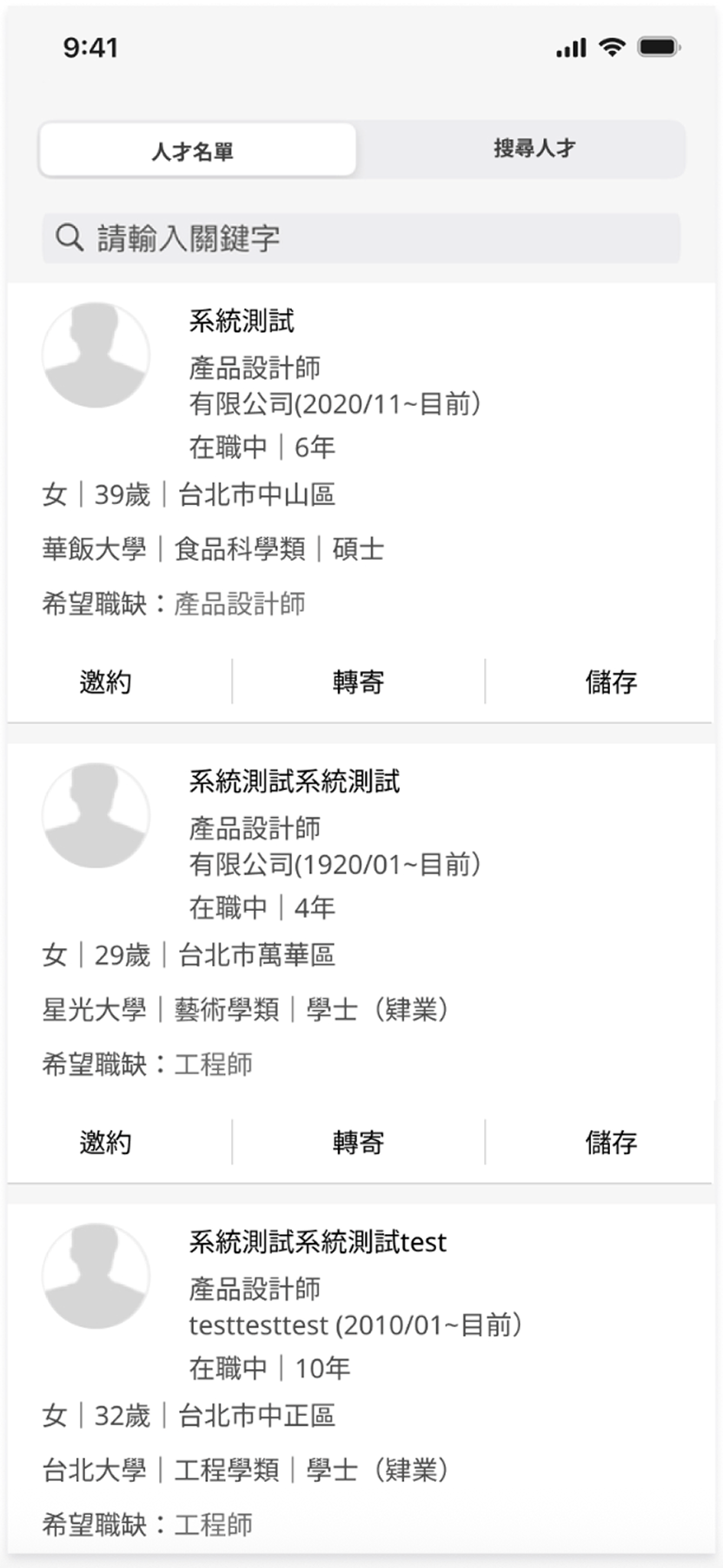
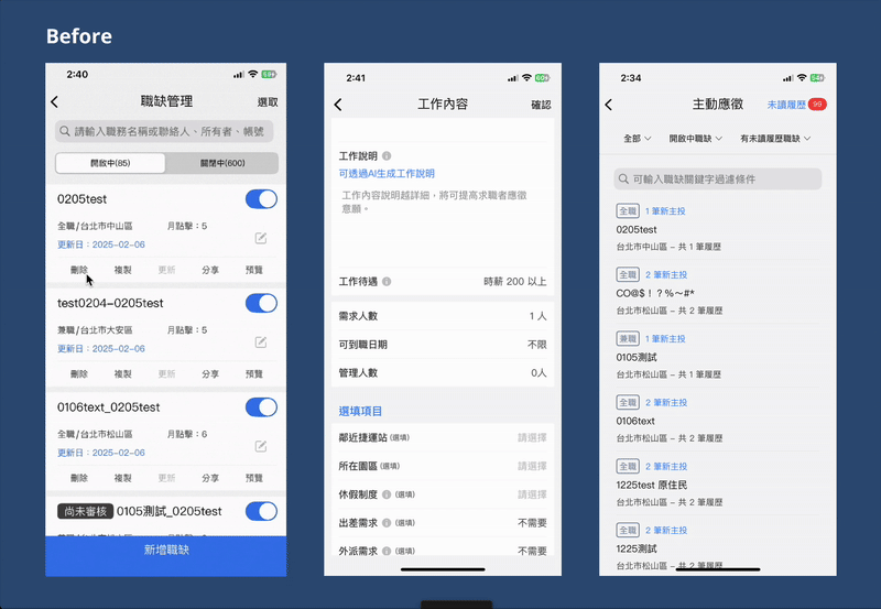
The recruitment platform had grown cluttered over time. Key tasks like posting jobs, searching resumes, and managing interviews were inefficient, leading to recruiter fatigue and lost candidates.
Overall, the search experience feels effortful without providing a stronger sense of confidence.
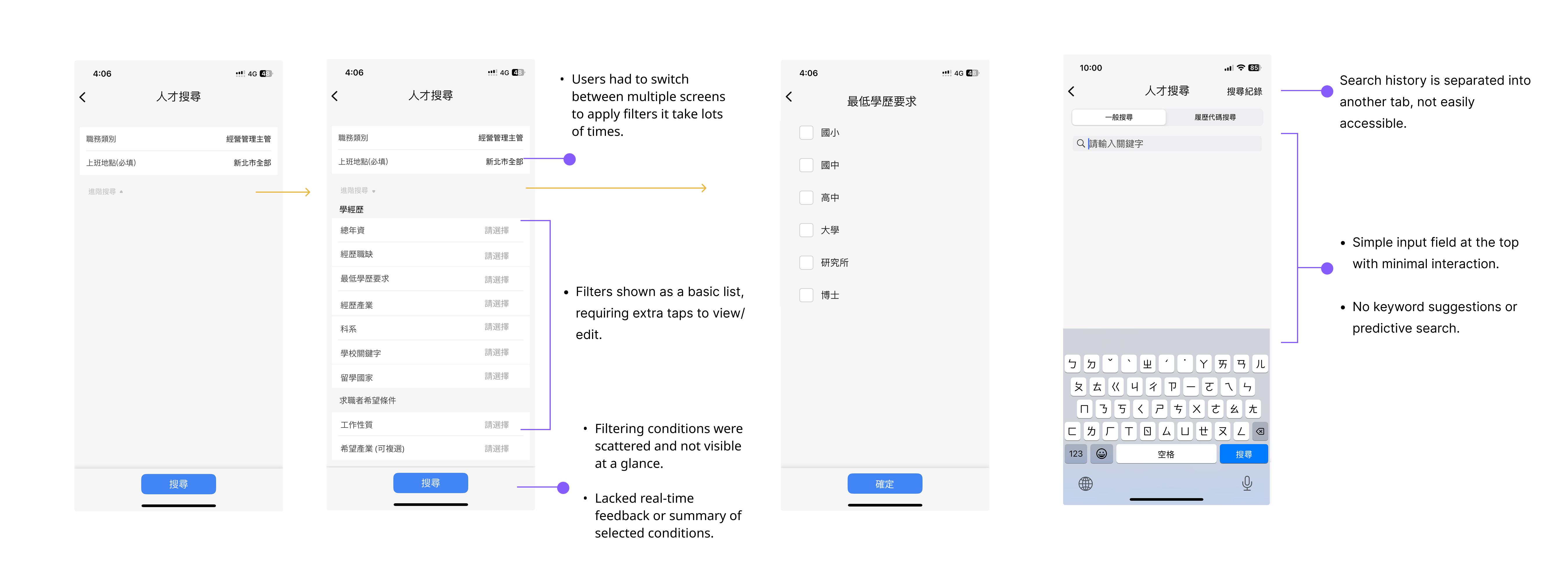
While setting up search criteria, users have to switch between multiple screens, making it difficult to maintain a clear overview of their current filters. The lack of real-time feedback also prevents users from knowing whether their configurations are effective. As a result, what should be a fast, focused decision-making process turns into repeated trial and verification.
From the user’s perspective, the system does not actively support thinking or narrowing down options. Instead, the responsibility of defining the “right” search criteria is entirely placed on the user. This leads to lower search efficiency and reduced confidence in the final results.
Searching through a large pool of resumes feels time-consuming and inefficient.
During stakeholder interviews, the CTO shared that HR clients struggled to review resumes efficiently.
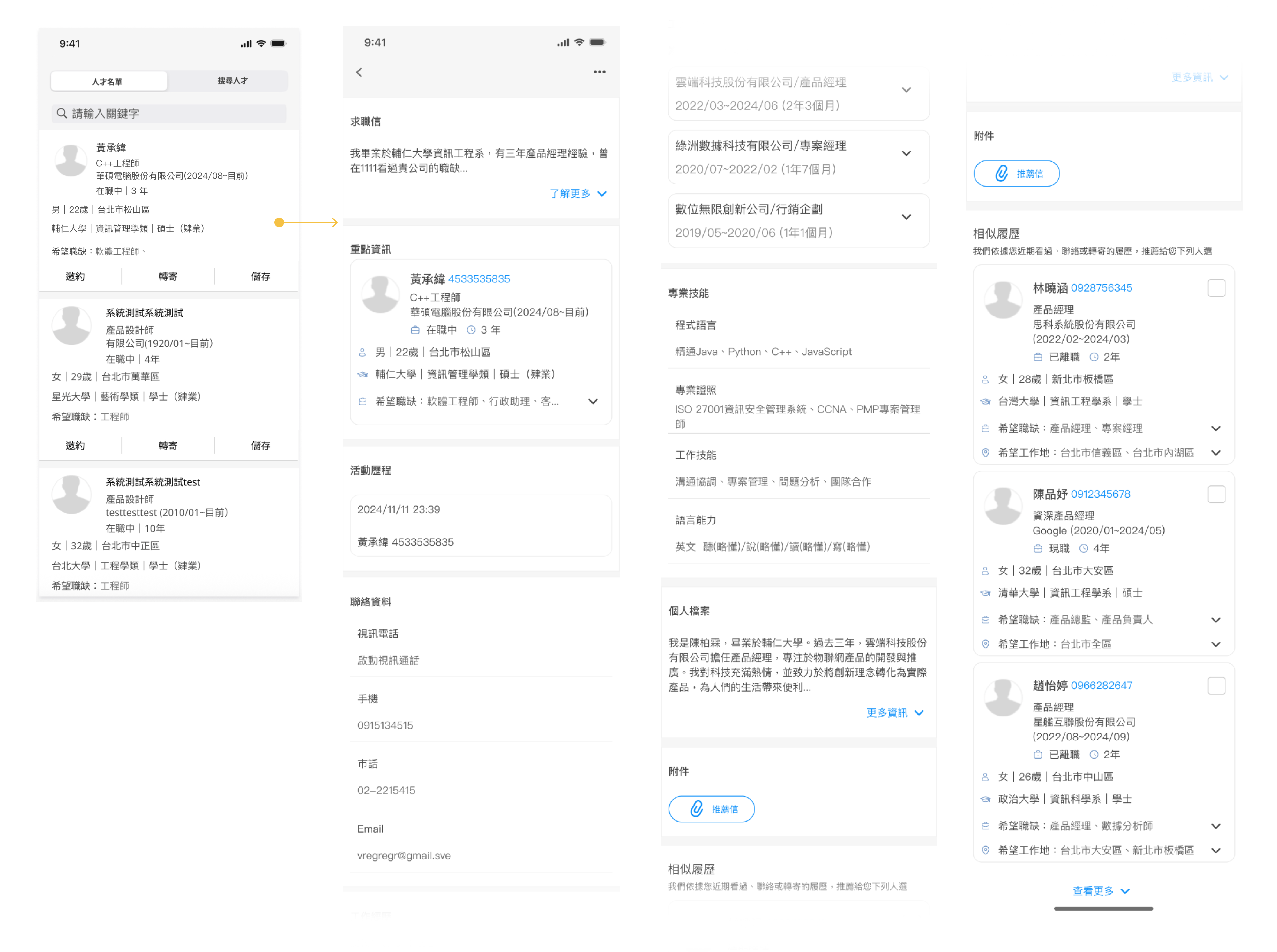
Also, Users must constantly switch between the resume list and detailed profiles to evaluate candidates, disrupting their screening flow. Each back-and-forth requires re-orienting to context, creating a fragmented and mentally tiring experience.
The system does not support quick comparison or early assessment of candidate fit, forcing users to spend time on low-value information checking. As a result, reviewing resumes becomes repetitive and labor-intensive rather than an efficient decision-making process.


The interface feels outdated and visually unappealing at first glance.
The flat, bare-bones layout lacks clear visual hierarchy, making it hard to stay engaged or quickly identify what matters.
Dense text, similar-looking elements, and limited visual cues prevent efficient scanning, forcing users to read line by line. As a result, the screen feels more like a function-driven back-office system than a modern, user-centered product—usable, but not inviting or efficient.
This design violates Nielsen’s usability heuristics by lacking clear visual hierarchy (Aesthetic and Minimalist Design), forcing users to scan dense information without visual cues (Recognition rather than Recall), and failing to clearly communicate structure or status (Visibility of System Status).
Goals:
Pain Points:
1. No clear starting point when searching for candidates
Recruiters face a large volume of resumes every time they open the system, but the product provides little guidance on where to begin.As a result, screening often feels like “finding a needle in a haystack.”
2. Highly repetitive, low-value review work
Recruiters must open resumes one by one, scan content, then return to the list—repeating the same actions continuously.Much of their time is spent on unavoidable but low-value interactions such as clicking, scrolling, and switching views.
3. High cognitive load and heavy reliance on individual experience
Recruiters must open resumes one by one, scan content, then return to the list—repeating the same actions continuously.Much of their time is spent on unavoidable but low-value interactions such as clicking, scrolling, and switching views.
4. Large time investment with low confidence in outcomes
The app team initially lacked a centralized component library, forcing designers to search for components across multiple files. I proactively led the effort to establish a design system, significantly improving design efficiency and consistency.
After that I got the insight:
Recruiters aren’t lacking judgment — they’re forced to spend most of their time on low-value, repetitive resume scanning, which dilutes the moments that actually require professional decision-making and turns hiring into a tiring, inefficient process.
HMW :
How might we help recruiters quickly identify high-potential candidates from a large pool, without forcing them to manually scan every resume?
Problem
Recruiters struggled to narrow candidates efficiently because dropdown-heavy filters increased cognitive load and broke scanning flow, especially on mobile.
Strategy
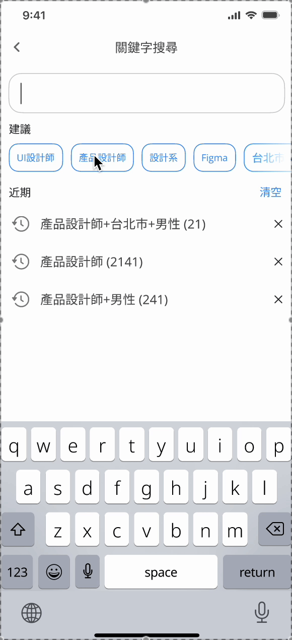
Make filtering lightweight and visible so users can narrow large result sets quickly without breaking their search flow.
Why
Dropdown-heavy filters interrupt users’ momentum and increase cognitive load, especially on mobile. To address the HMW, the system must enable fast refinement with minimal effort, allowing users to focus on results rather than filter configuration.
Design Implications
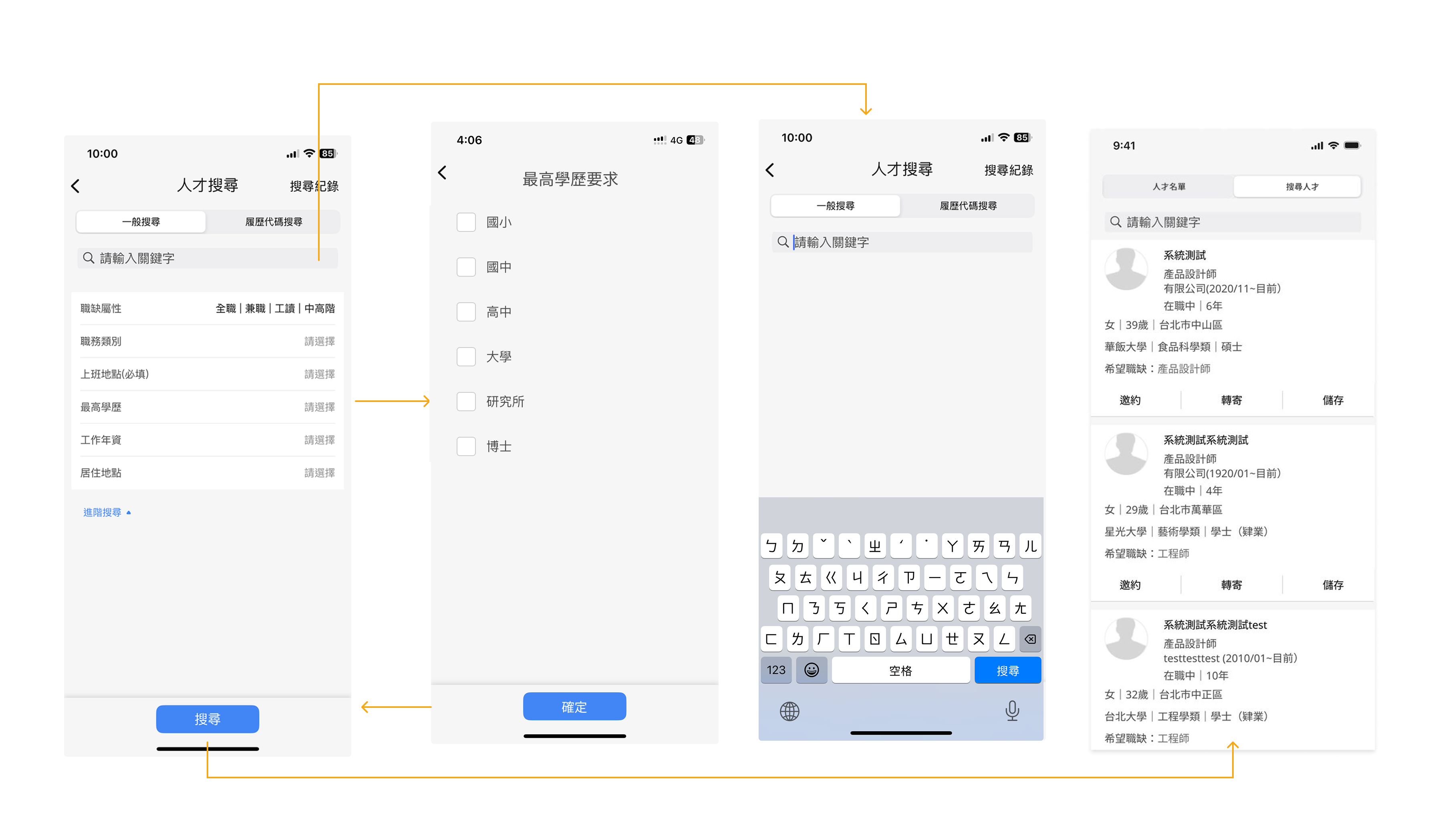
Filtering was redesigned using visible, chip-based controls with real-time suggestions, combined with a horizontal scroll layout to optimize limited screen space. Together, these choices lower friction and help users complete multi-condition filtering faster and with greater confidence.
Problem
Recruiters screening large volumes of resumes struggled to build decision focus. Filters were slow to adjust, results were unpredictable, and it was hard to know whether criteria were too broad or too strict.
.gif)
To help recruiters identify high-potential candidates from large applicant pools, I focused on reducing manual filtering and low-value resume scanning.I redesigned advanced search into a single-page, chip-based filtering experience that minimizes context switching.A real-time result count provides immediate feedback, helping recruiters calibrate filters confidently without trial-and-error.
To support faster first-pass screening, I surfaced AI-powered matching scores and introduced horizontally scrollable resume cards for quick comparison.Together, these solutions shift recruiters’ time from repetitive scanning to focused decision-making.The result is a faster, more confident screening flow that scales with high-volume hiring.
Problem
Recruiters had to open too many resumes to understand candidate fit. Rich resume cards showed more data, but excessive information slowed scanning and made comparisons harder.
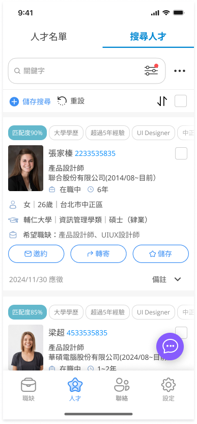
To reduce manual resume scanning, I surfaced AI match scores and high-signal visual tags directly in the resume list.This allows the system to perform a first-pass screening before recruiters open individual profiles.Key attributes such as education and location are visible at a glance, supporting rapid comparison across candidates.By shifting evaluation earlier in the flow, recruiters can prioritize high-fit candidates with less cognitive effort.AI signals guide attention without replacing human judgment, preserving trust and decision control.The result is faster, more consistent shortlisting from large candidate pools.
Technical Considerations & Design Trade-offs
After recruiters submit their search criteria, the system generates an AI-based match score for each candidate profile to support faster first-pass screening.However, introducing AI scoring into hiring workflows requires careful handling of trust, performance, and data uncertainty.
Explainability over Black-box Scores
AI match scores can feel opaque and reduce recruiter confidence if presented as absolute judgments.To address this, scores are positioned as screening aids, not rankings.Instead of exposing complex model logic, the UI highlights high-level contributing signals—such as skill overlap and experience relevance—so recruiters understand why a candidate scores higher without cognitive overload.
Handling Resume Data Inconsistency
Resume formats vary widely, and unstructured data can lead to noisy or imprecise scoring.To avoid false precision, match scores are visually softened using rounded values and ranges, reducing over-reliance on exact numbers and encouraging human validation.
Bias & Trust Calibration
AI scoring risks reinforcing historical hiring bias if treated as an authoritative filter.The interface deliberately avoids “top candidate” language and ensures match scores do not dominate the visual hierarchy.Recruiters are guided to use AI as one signal among filters, availability, and experience—keeping human judgment central.
Performance & Scalability
Real-time scoring across large candidate pools can introduce latency and disrupt search flow.To maintain perceived speed, candidate lists load immediately after search submission, while AI match scores populate asynchronously—allowing uninterrupted browsing.
Design Outcome
Rather than aiming for perfect prediction, this design focuses on reducing cognitive load and accelerating comparison under real-world constraints.AI helps recruiters narrow focus faster—without replacing expertise or decision ownership.
Problem
Recruiters screening large candidate lists repeatedly revisited the same profiles and had to switch contexts to adjust filters, slowing down decision-making and breaking focus.
.gif)
To maintain screening momentum, I integrated core actions directly into the candidate list view.Features like “Hide Viewed,” persistent match scores, and bottom-sheet filters reduce interruptions during review.Recruiters can skip reviewed profiles, adjust filters quickly, and compare candidates without leaving context.Advanced options are revealed progressively, keeping the interface focused and uncluttered.This design minimizes context switching in high-volume screening scenarios.The result is a smoother, more continuous decision-making flow for recruiters.
To improve usability and reduce cognitive load, I refined the UI using Jakob Nielsen’s 10 usability heuristics, focusing on layout clarity, consistent structure, and visual priority cues.
I believe that building influence in an organization requires accumulating small wins. Instead of insisting on large-scale reforms or full research cycles, I focused on incremental improvements that could quickly demonstrate value. This approach helped build trust in design, gradually earn more resources, and provided me with valuable experience in iterative redesign.
At this stage, we needed to prepare a comprehensive briefing for customer support, and the the outsourced PM proposed delivering the full redesign upfront. However, because our user base was large, a sudden overhaul risked alienating existing users. I therefore recommended a progressive rollout strategy—prioritizing features by usage frequency and revenue impact. This balanced risk management with design value, ensuring the most impactful changes reached users first.
Proposed rollout sequence:Medium frequency, high revenue impact: Candidate Search / Sourcing → Scheduling (Interview Scheduling) → Job Posting → Progress Reporting
High frequency, high revenue impact : Resume Screening
To evaluate whether the redesign achieved its goal, I defined the following success indicators:
1. Resume Screening Time ↓
Recruiters should be able to review resumes more efficiently. A lower average time spent per resume reflects improved interface clarity and decision support.
2. Incomplete Draft Interruption Rate ↓
The auto-save function should significantly reduce data loss and frustration from accidental exits. A drop in interruption incidents indicates improved flow resilience.
3. HR Satisfaction Score ↑
Post-redesign usability testing should yield a higher satisfaction score, validating whether the redesign meets HR needs and expectations.
4. Job Post Completion Rate ↑
More users should be able to smoothly complete and publish job listings. A higher conversion rate from draft to published post reflects improved usability and guidance.
Due to limited resources, I lean toward adopt cost-effective and lightweight validation methods to ensure the redesign addressed core usability issues at first:
Drove the creation of a shared component library.
The app team initially lacked a centralized component library, forcing designers to search for components across multiple files. I proactively led the effort to establish a design system, significantly improving design efficiency and consistency.


Although this project was ultimately not launched due to company-level decisions, and we couldn’t track its real-world performance, the process revealed many areas for improvement and left a few regrets. Still, it became a valuable learning experience that significantly sharpened my UX judgment and design communication skills.
Here’s what I gained from this journey:
AITech
AIAudio
NoiseCancellation
WebAppDesign
SoundDesign
VoiceEnhancement
B2CDesign
UserResearch
CryptoUX
UXDesign
Notetaking
AIForThinking
B2CDesign
AIAgent
KnowledgeManagement