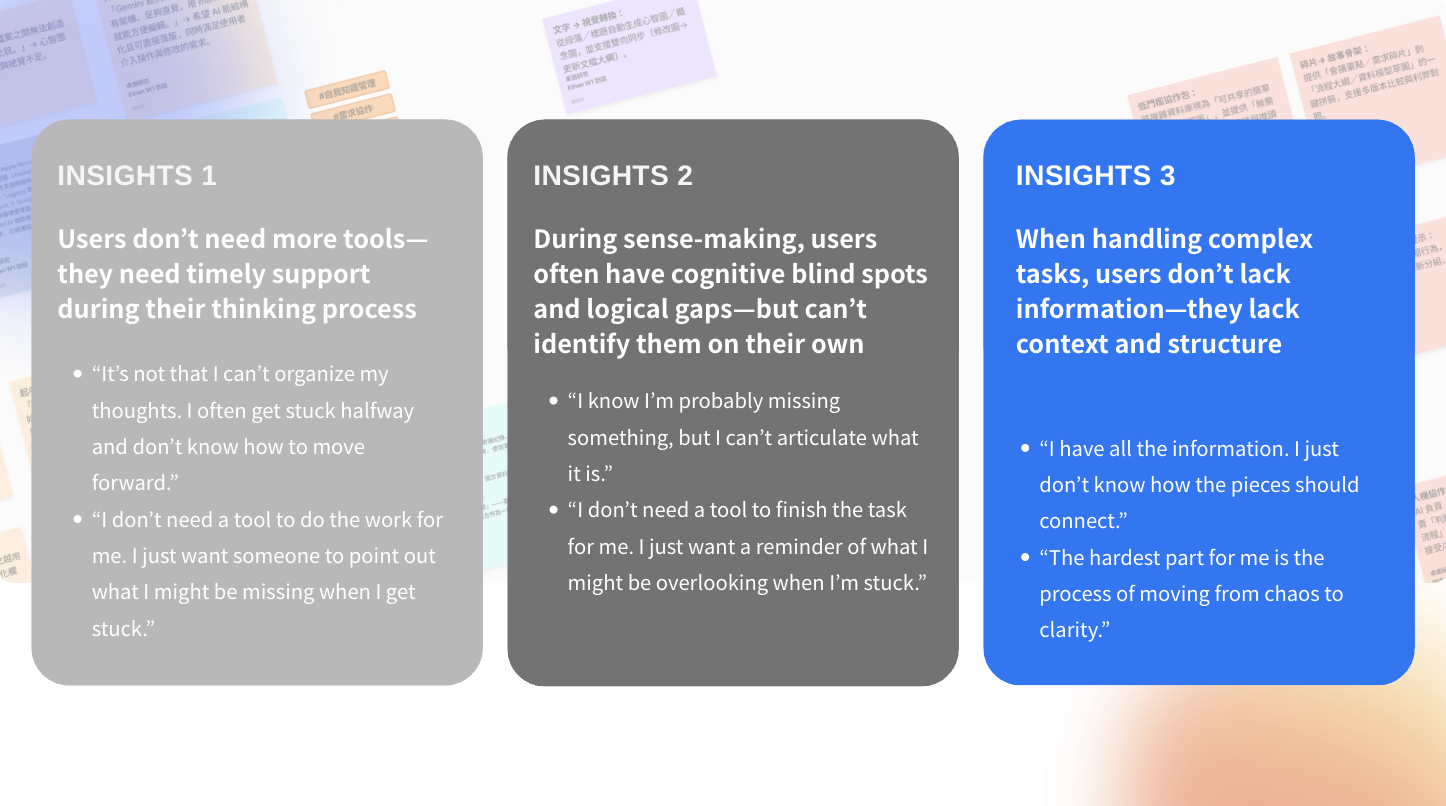
Heptabase users often feel lost when working with large volumes of academic or project-related information. Even with visual tools in place, the product does not always effectively support the structuring of core thinking. This pain point affects not only new users, but also advanced users, who may feel mentally blocked or compelled to pause their thinking during large-scale research.
Heptabase is a visual thinking tool designed for learning and researching complex topics. By 2025, the product had achieved strong retention and entered its next growth stage: integrating AI Agent and AI Browser to help users more efficiently digest information, build structure, and deepen understanding.The business goal was to boost MRR growth and long-term retention, especially Week-24 usage. With competitors like Notion and Obsidian focusing on general note-taking, Heptabase aimed to differentiate through AI-enhanced research workflows.This project explores how to design a smooth, context-aware AI experience that truly supports real learning and research tasks for learners, students, and knowledge workers.
To design Heptabase’s next-generation AI thinking system—Auto Structure and AI Reviewer—that helps users reveal structure, gain insights, and improve their thinking through intuitive, collaborative AI interactions that fit naturally into their existing workflow.
Role
Design Lead
Product designer
Facilitator
Deliverables
User research
POC test
Usability test
DesignUX flows & IA
UI design
Iteration
Within a tight 7-week timeline, I led end-to-end research and defined a core solution under unclear engineering constraints and limited implementation certainty.
Leading a mixed-experience team, I owned high-risk decisions, set the research and design framework, and ensured execution quality—balancing speed with precise problem discovery.
Design Lead * 1
UI Junior designer * 2
Junior designer * 3
Winner of the Best Insight Award
Selected as a Top 8 finalist among 16 teams

At first, we got the business goal from the company owner.
Primary KPI
Secondary KPIs
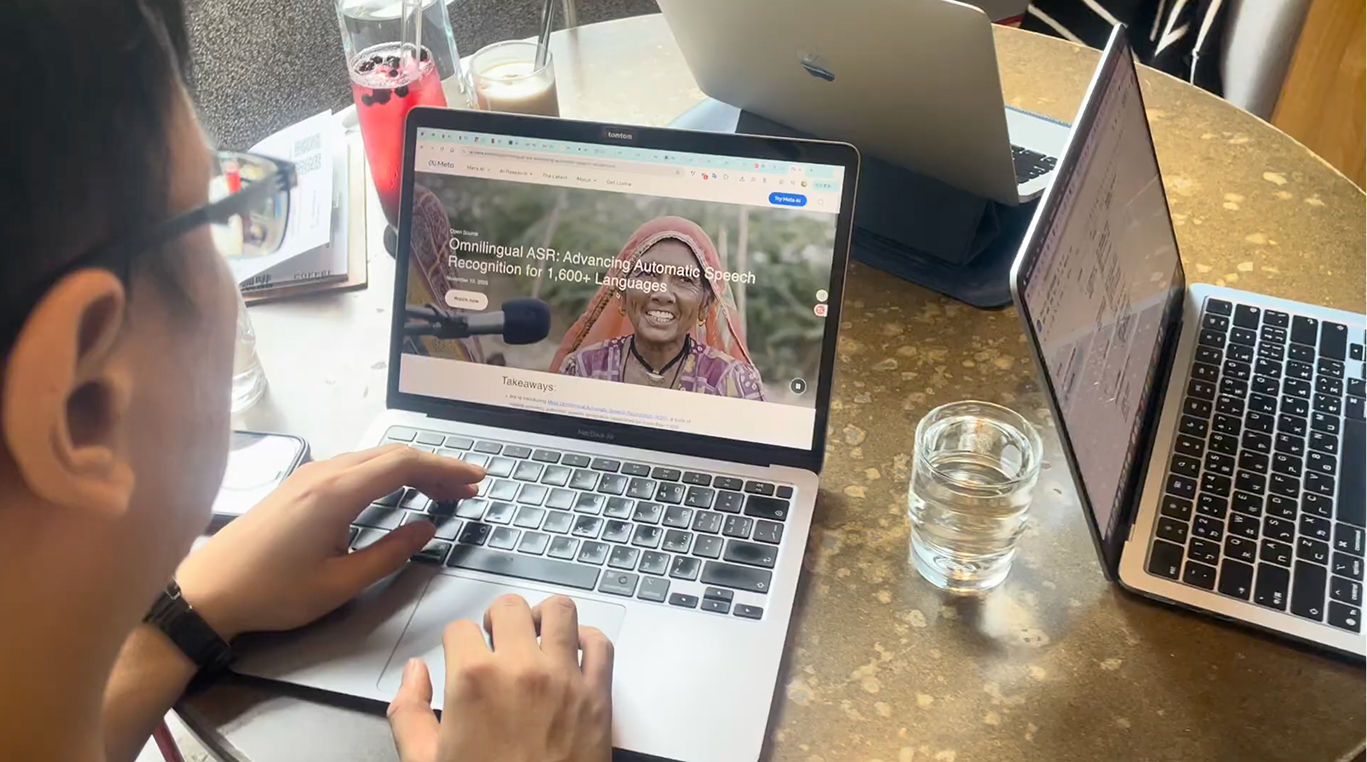
After receiving the topic—How can we design an AI agent with a smooth, context-aware experience that helps users learn and handle complex research tasks?—we began by conducting a competitive analysis and accumulated background and context of the project and product. Next, we wanted to understand the real problems users face, so we ran user interviews to identify the key opportunities and entry points for our design.
Competition analysis:
From our competitive analysis, we found that although NotebookLM excels in citation and source retrieval, it is limited in guiding users through structured, project-oriented workflows. Notion and Obsidian, on the other hand, offer strong control over databases and content structure, but their linear editing environments—or the high cost of maintaining non-linear structures—often restrict intuitive thinking.
In contrast, Heptabase provides a unique visual knowledge map that supports spatial thinking and intuitive organization. This revealed a clear opportunity in the market:
Most tools focus primarily on knowledge storage, while Heptabase’s true strength lies in helping users build thinking structures. We believe that combining NotebookLM’s strengths in citation and source retrieval with Heptabase’s visualized knowledge maps would enable AI to act as a thinking partner—one that can surface connections, remove mental bottlenecks, and proactively help users construct meaningful structures. This represents a competitive advantage that is difficult for others to replicate.
Research Objective: Understand how users interact with information when handling complex tasks.
User Interview
I was responsible for creating the recruitment survey and developing the user interview questions. I also served as the lead interviewer for all six user interviews.
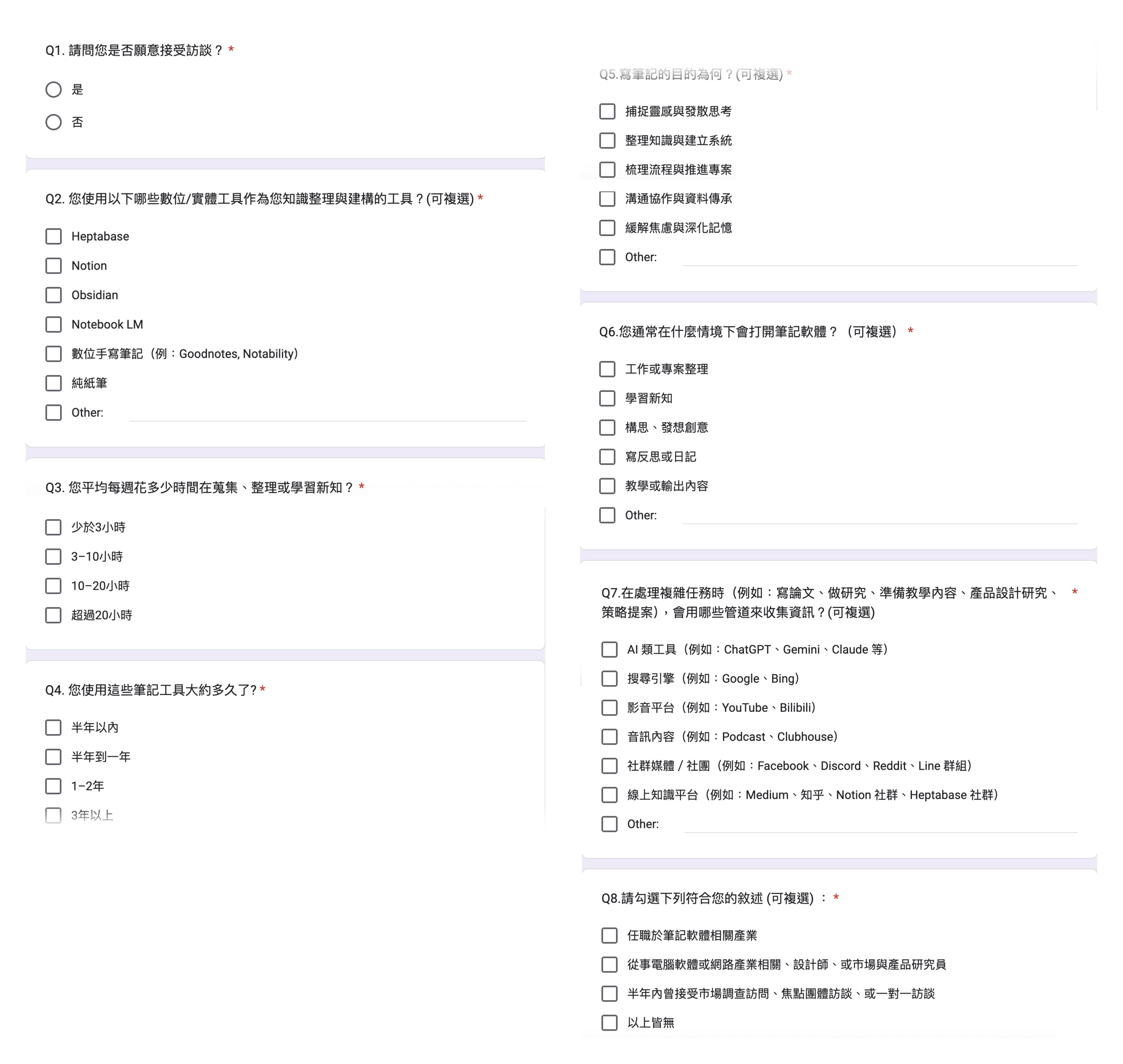
Ideas about designing questionnaire
This questionnaire was designed to screen and recruit participants with real knowledge-management experience.It focuses on actual tools, behaviors, and task contexts, while keeping the survey short and lightweight so it can be completed within three minutes, reducing friction and increasing response rates.
After sending out the recruitment survey, we received all most 70 sign-ups.
Week 1 received
45
sign-ups
Accumulated in Week 2
67
sign-ups
After phone screening, I choose 6 people to conduct the 60 minutes user interview. Before the official interviews, I also ran a pilot session to test and refine the interview questions. Based on the pilot and the actual interviews, I continually adjusted the interview guide to ensure clarity and depth.
Industry professionals (such as designers, researchers, or individuals frequently interviewed for work) were excluded to avoid expert bias and over-articulated responses.These participants often rely on well-practiced frameworks and interview heuristics, which may not reflect the natural, real-world behaviors and thinking processes of everyday users when handling complex tasks.

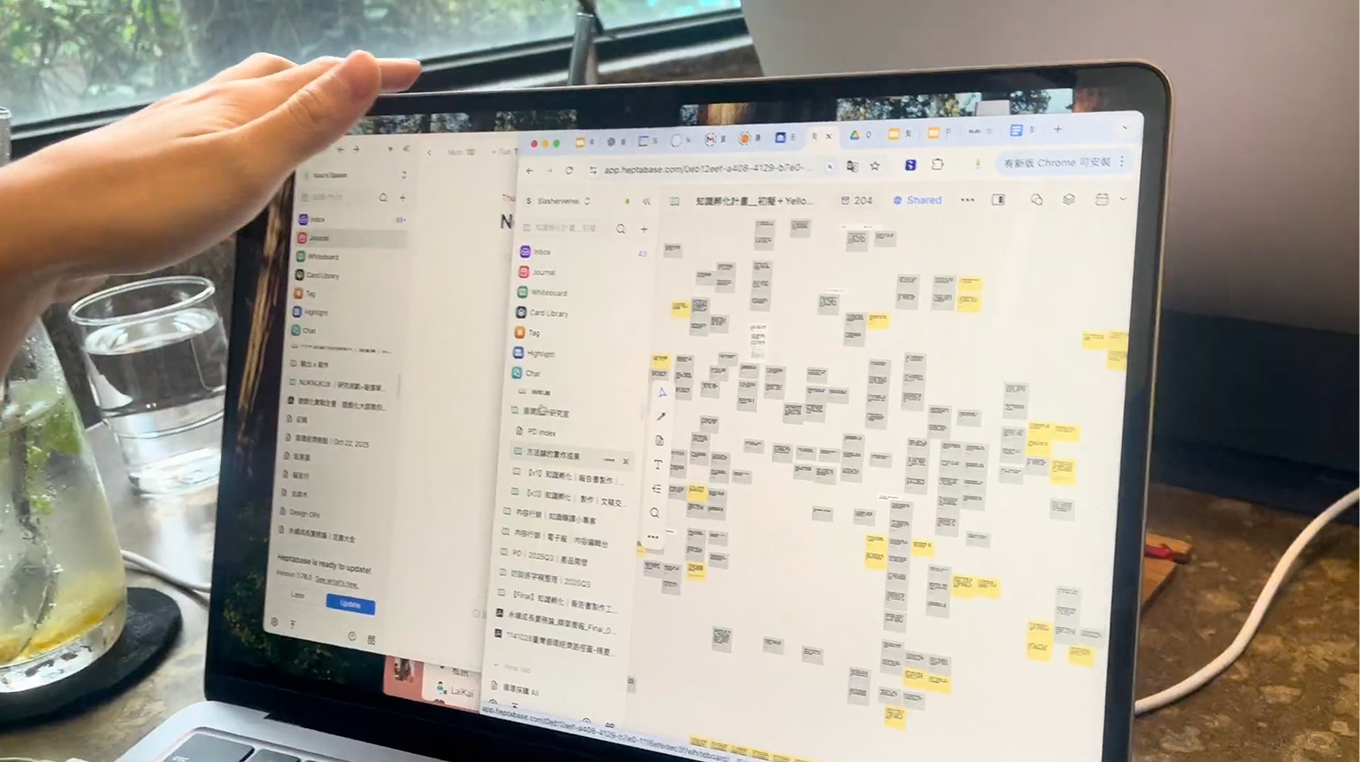
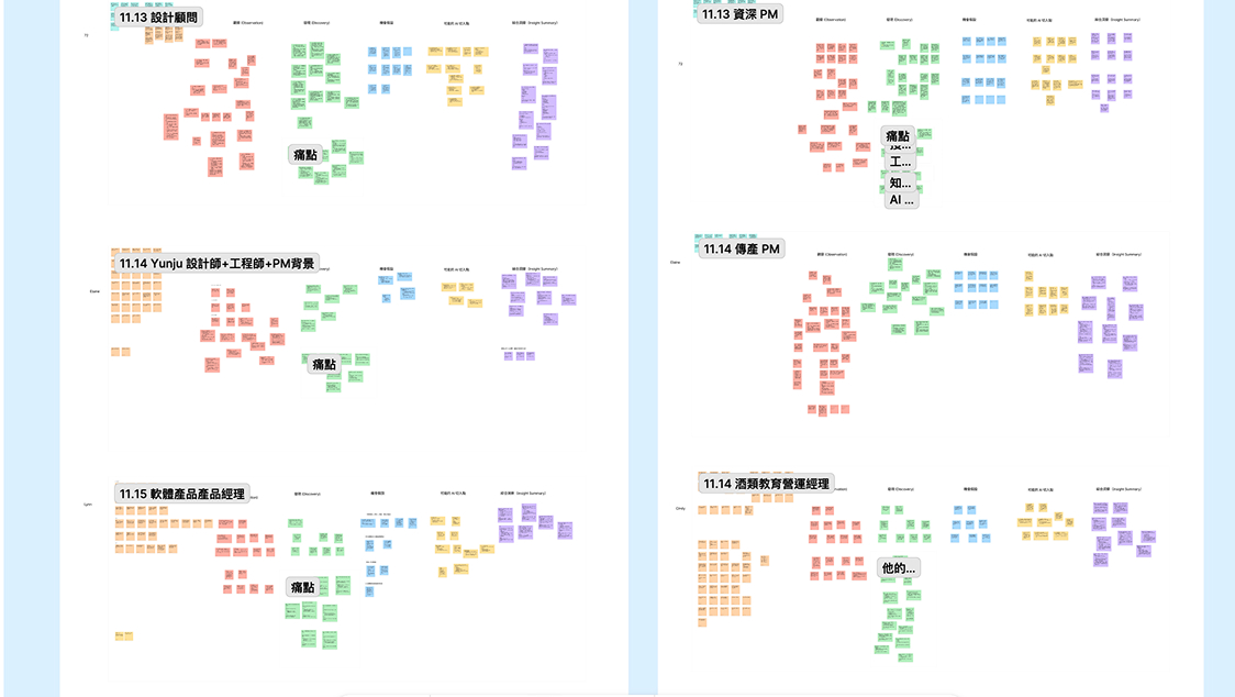
After completing the user interviews, I facilitated a workshop where we organized the findings using an Affinity Diagram. We then synthesized the insights and determined the product direction through a voting process.
Afterward, we formulated several HMW questions based on the insights and voted to select the final one.
HMW help users uncover structure and blind spots in their thinking while organizing complex information—without disrupting their natural workflow?
To address these problems, I hosted a workshop, and applied the 6–3–5 Brainwriting method to generate potential solutions.
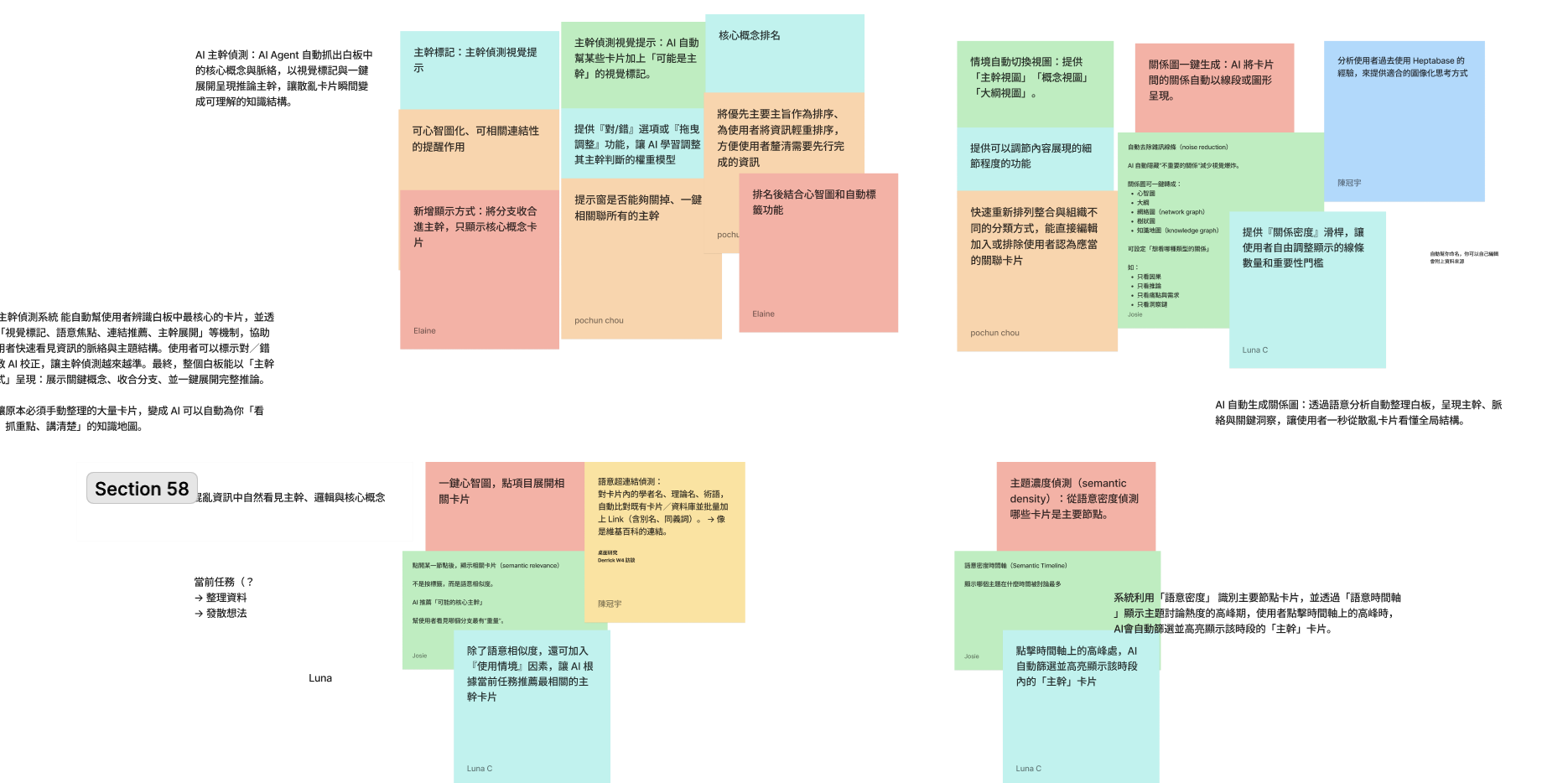
After that, we narrowed down the ideas through voting. To ensure our resources were invested in the right direction—and to validate whether users actually liked these ideas—we recruited five Heptabase users to test the proof of concept.
I recruited five Heptabase users to participate in concept validation sessions, ensuring our ideas aligned with real user needs. I worked with two UI designers to propose 5–10 ideas to users and create wireframes that visually communicated our concepts based on our brainstorming sessions.
Qualitative Feedback from Concept Validation
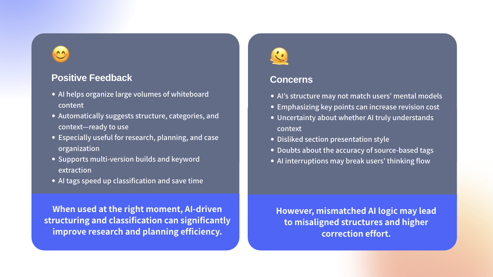
Given our time and resource constraints, we prioritized the design direction and chose the two strongest features to continue refining according to user feedback. These two concepts were initially proposed by me.
Besides, one challenge I encountered was resolving differing opinions within the design team, so I relied on user feedback to understand which solution approach worked best and used it to guide our decision-making.
Concept 1 : AI Reviewer
I was responsible for design the UIUX for the AI Reviewer.
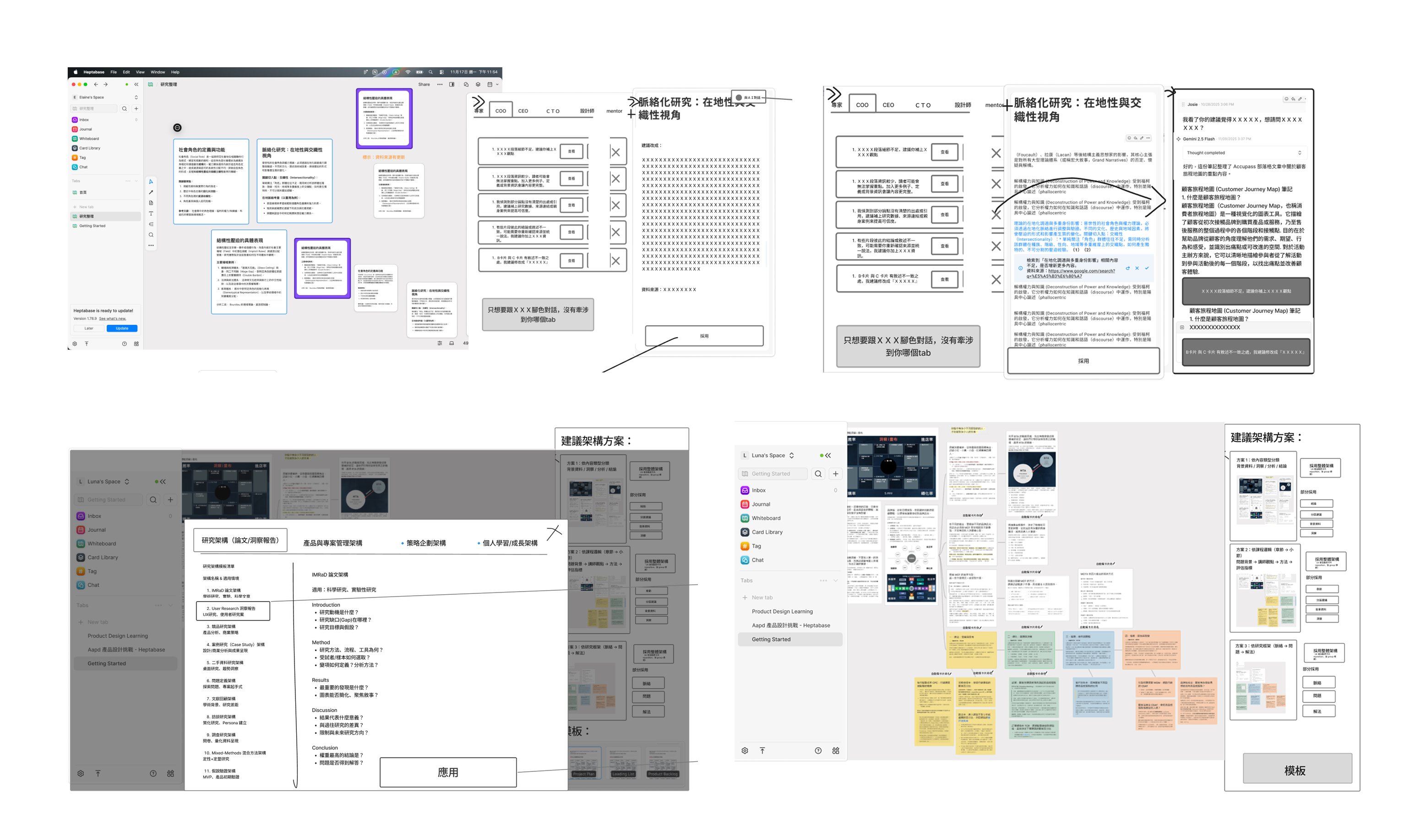
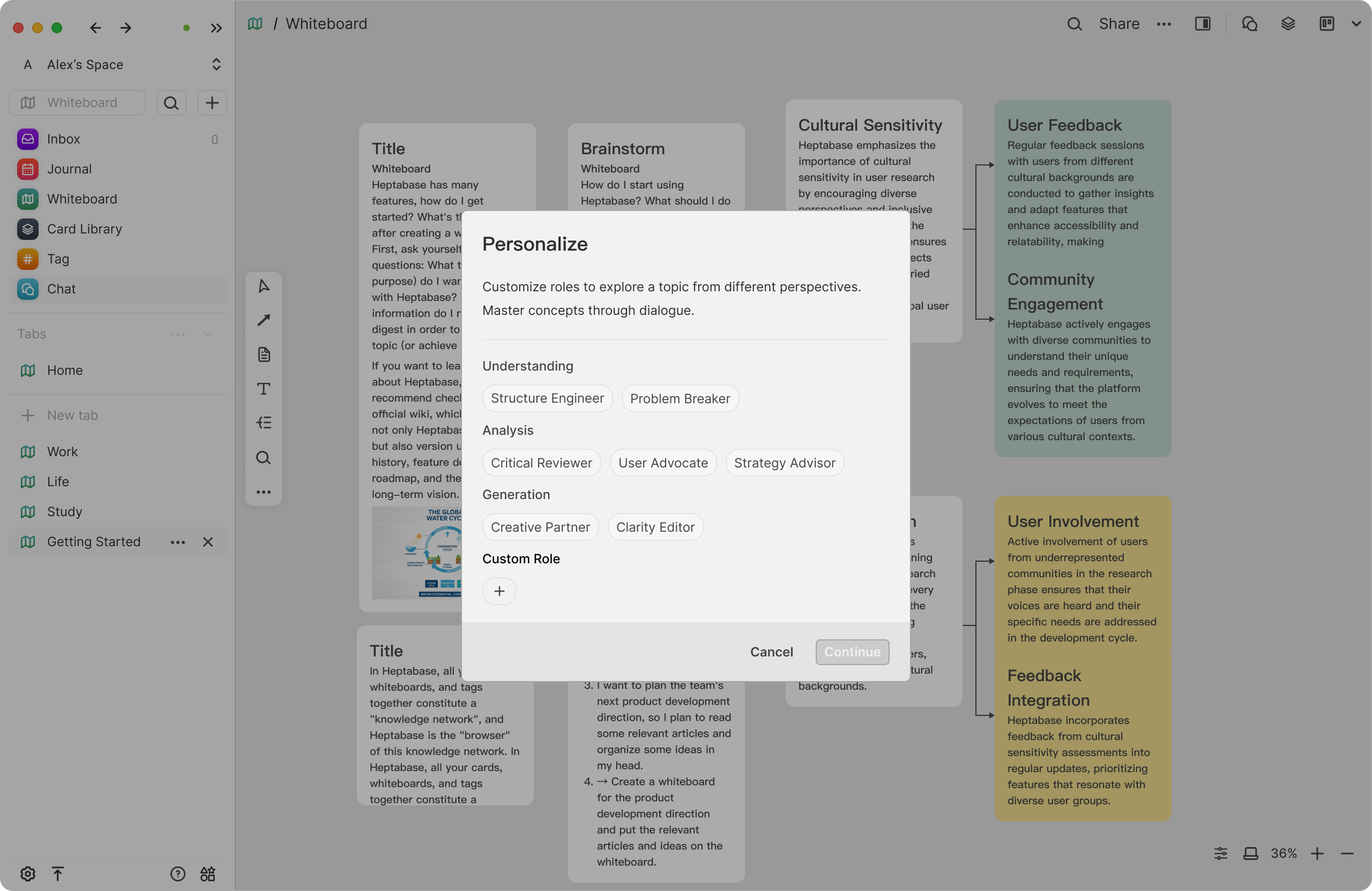
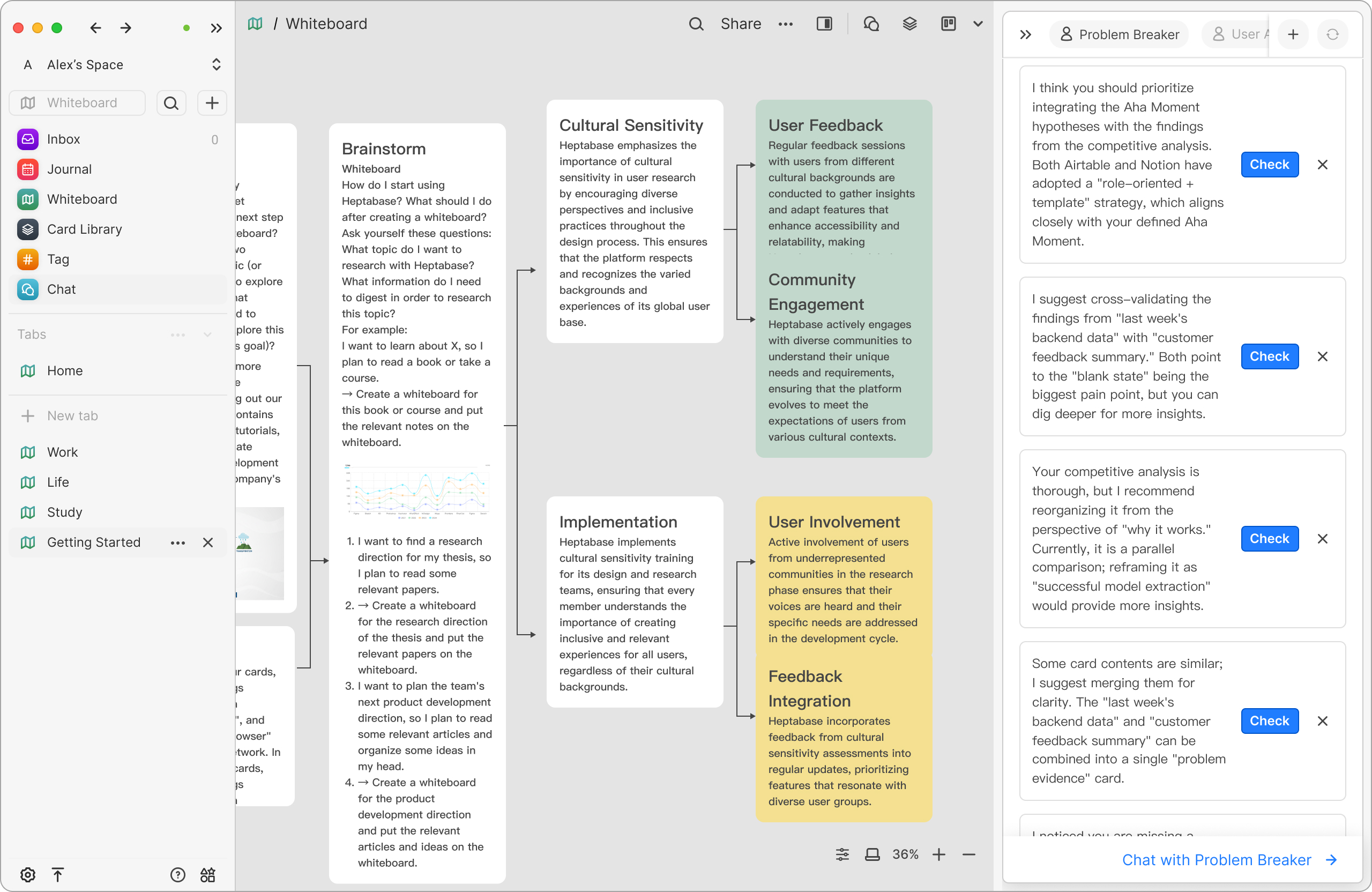
The “AI Reviewer” stays quietly by the user’s side when needed.Rather than giving direct answers, it offers different perspectives from multiple AI reviewers to help users break through mental blocks and think more clearly.
It behaves like a coach who can understand the topic you’re organizing on the whiteboard, provide precise suggestions with verifiable references, point out gaps or contradictions, and guide you forward in your thinking process.
Concept 2 : Auto Structure
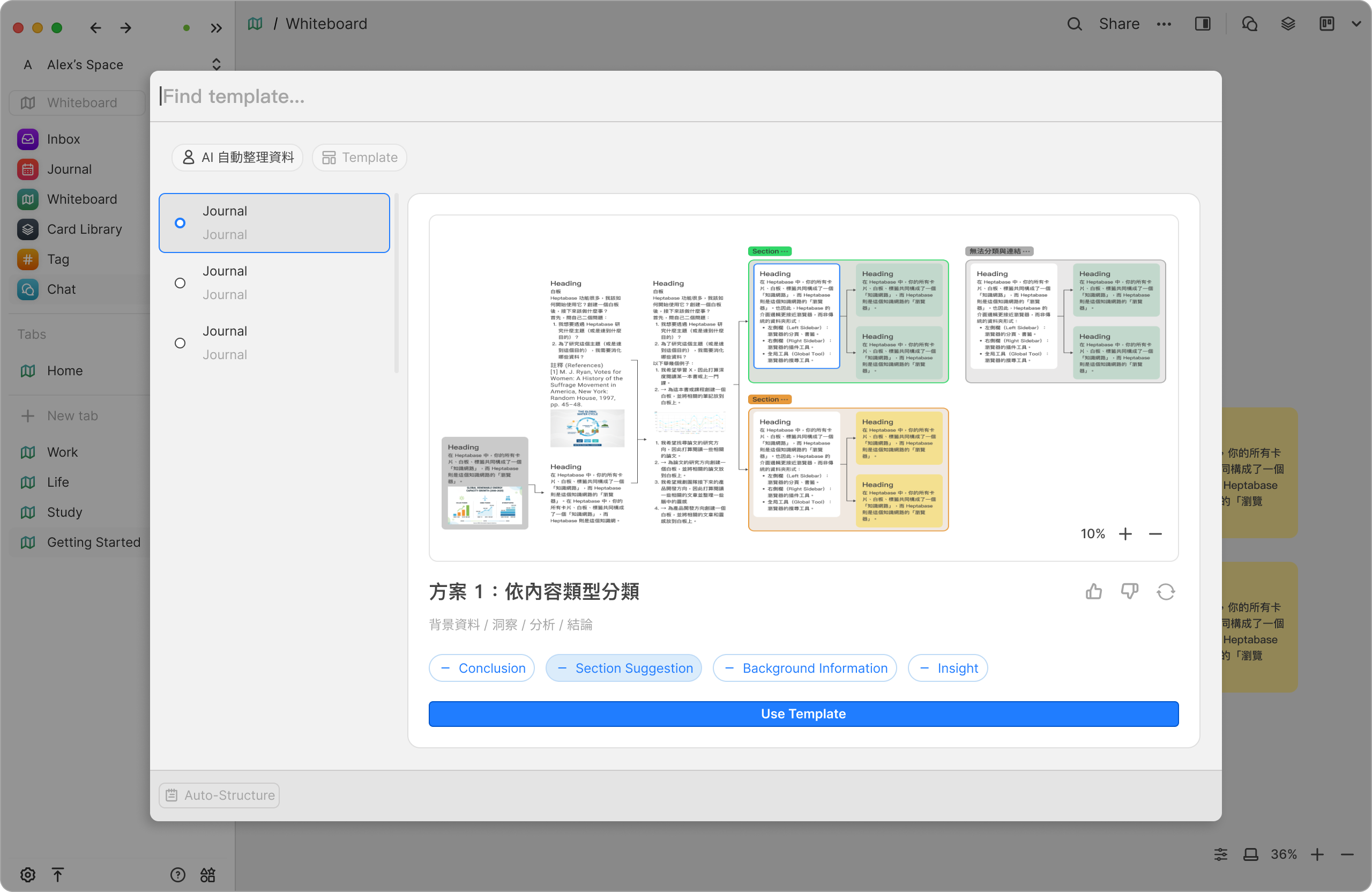
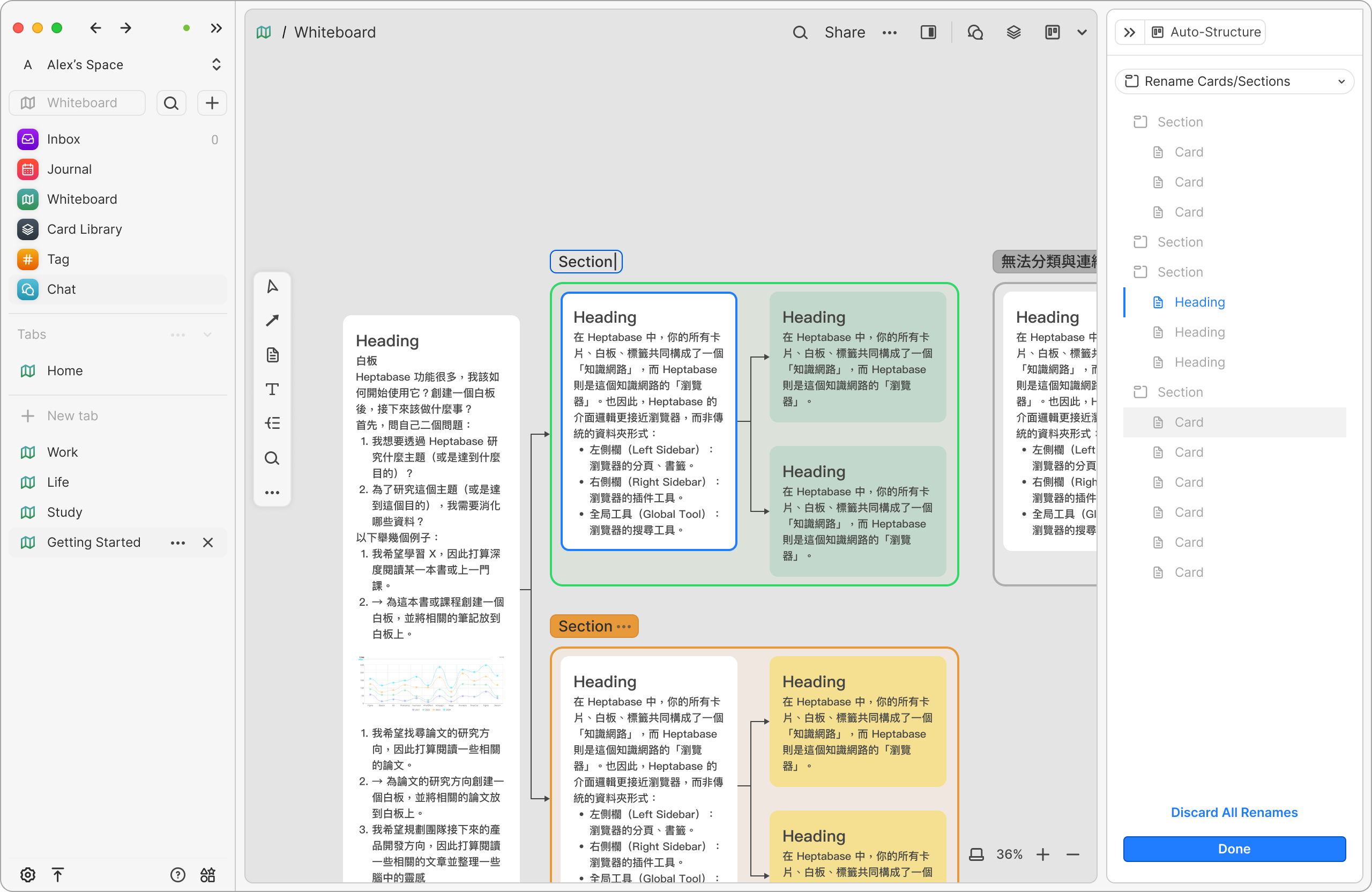
I was responsible for design the UX for the Auto Structure.
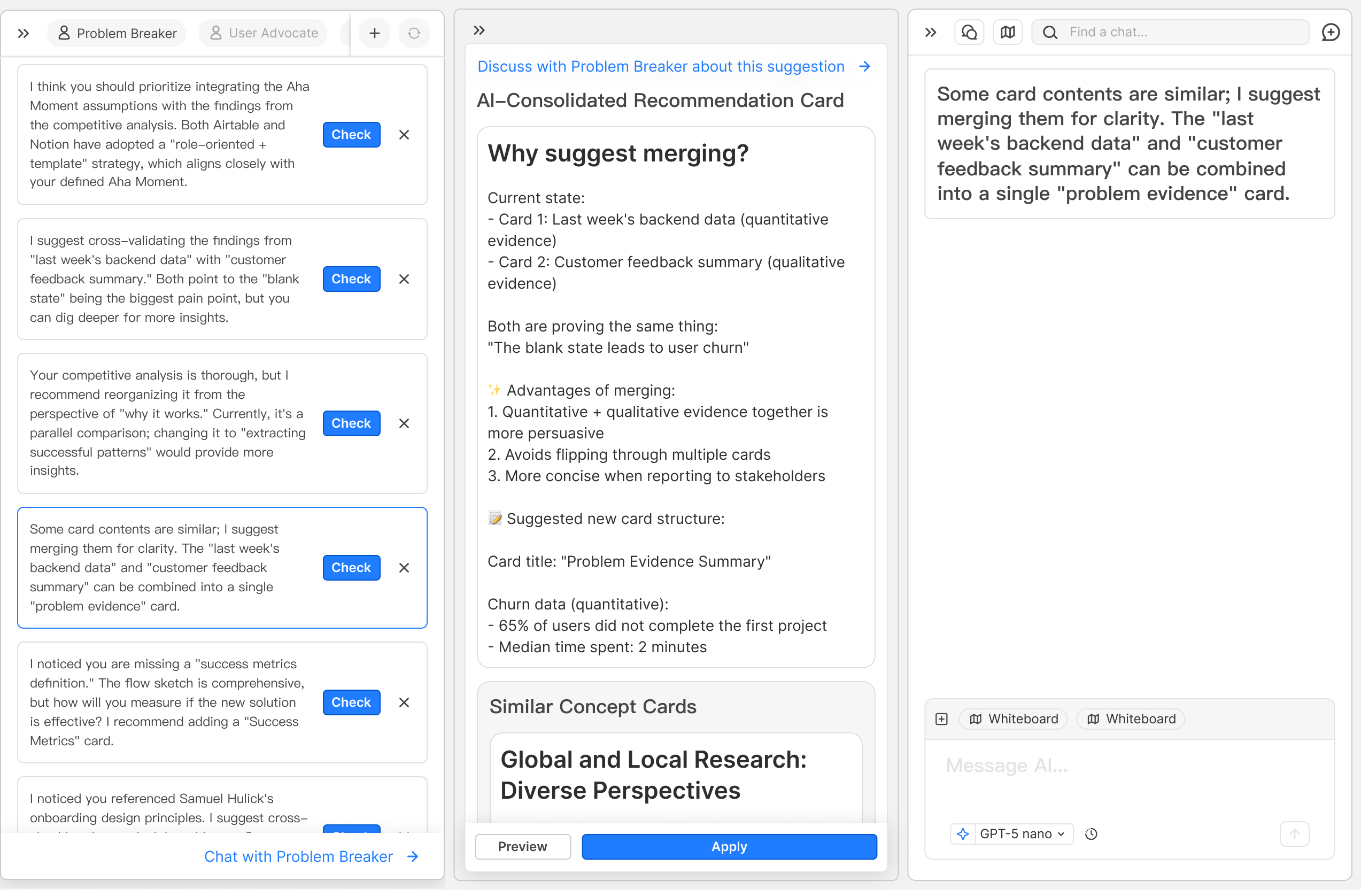
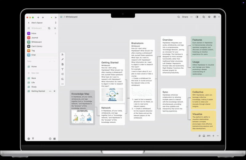
When the whiteboard becomes crowded with cards, connections, and screenshots, the AI Context Architect reads the existing content and proposes possible structures and relationships. It quickly transforms scattered information into a clear, organized hierarchy.
Each suggestion comes with sources and reasoning, and users can choose to accept or ignore them — maintaining full control at all times.
I was responsible for design the UX for the Auto Structure.
When the whiteboard becomes crowded with cards, connections, and screenshots, the AI Context Architect reads the existing content and proposes possible structures and relationships. It quickly transforms scattered information into a clear, organized hierarchy.
Each suggestion comes with sources and reasoning, and users can choose to accept or ignore them — maintaining full control at all times.
User Needs × Business Goals
How Auto Structure / AI Reviewer drives business impact
Core user need
Users want to quickly extract meaningful structure and new perspectives from large volumes of information, while minimizing thinking disruption caused by frequent context switching between tools.
Increase Paid Conversion (MRR Growth)
Auto Structure and AI Reviewer provide a clear upgrade value.For knowledge workers with high cognitive demands, Insight AI significantly increases willingness to pay.
Drive User Acquisition (Acquisition)
By clearly differentiating from tools like Notion and Obsidian, the product attracts users who prioritize deep thinking and structured learning.
Improve Long-term Retention (Week 24 Retention)
As the whiteboard becomes the user’s primary thinking space, daily usage naturally increases, reducing churn and strengthening long-term engagement.
During the design process, we were unsure whether the current UI/UX would be intuitive for users. To validate this, I proposed that we need to plan usability testing with five Heptabase users. However, due to scheduling conflicts that week, many users were unavailable. As a result, we opened the sessions to two additional participants who were product designers. Their feedback was treated only as supplementary reference. Before the sessions, we clarified that we were not asking for their professional design opinions, but rather wanted them to use the product purely as Heptabase users and share any issues or difficulties they encountered.
I was responsible for recruiting participants, designing the usability test tasks, leading the interviews, and synthesizing the feedback from all five users.
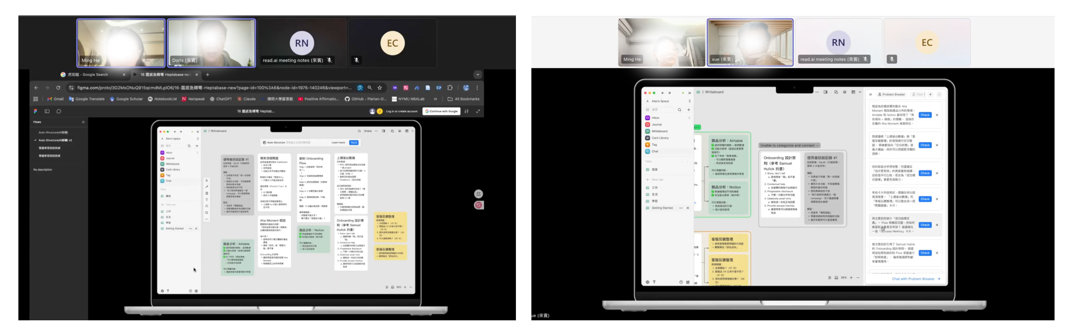
Given the limited time, I organized the issues we identified using a usability feedback matrix—Severity × Frequency—to help us accurately determine the priority for design improvements.
Iteration
AI Reviewer
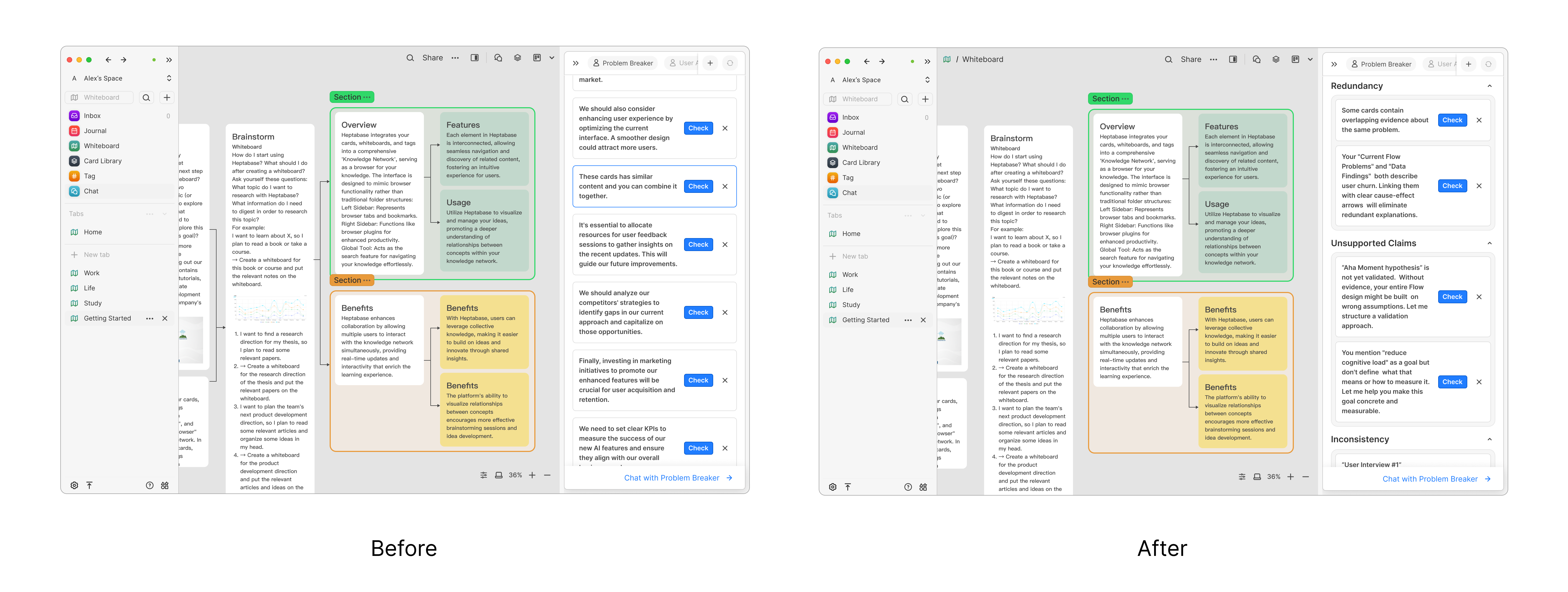
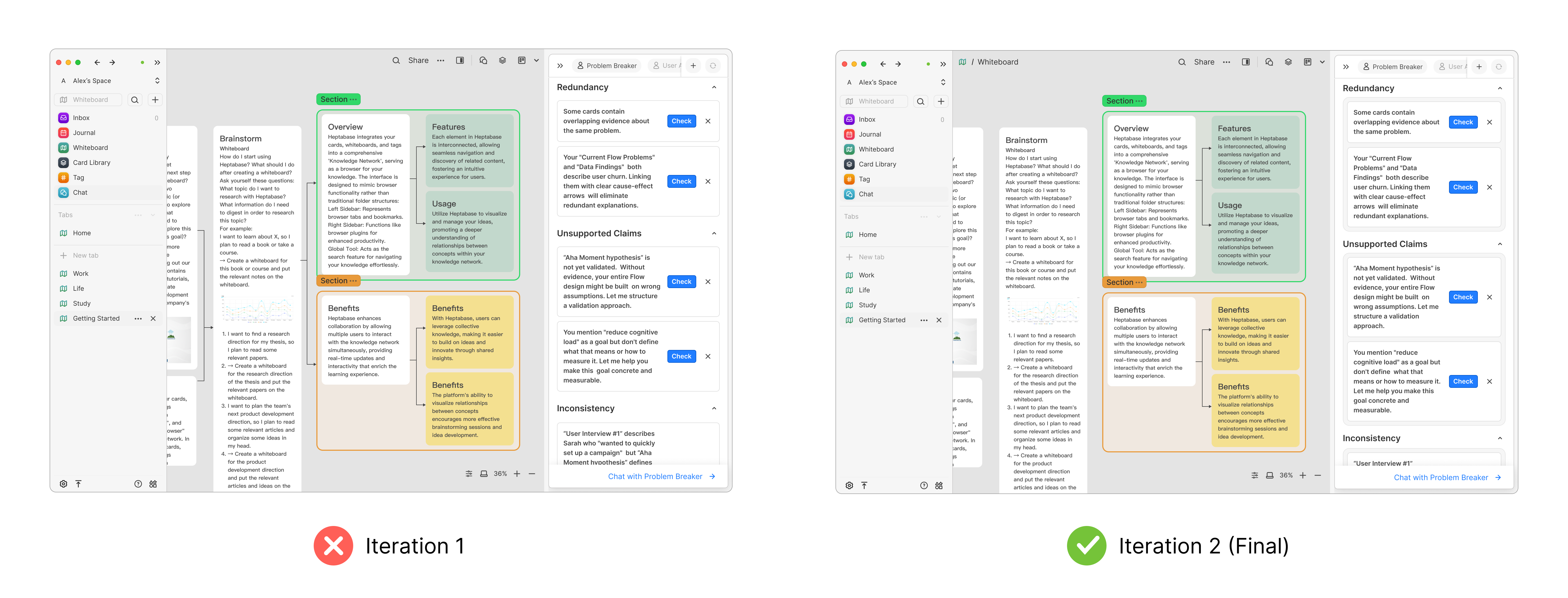
Why it should be changed : User testing showed that too many suggestions at once felt overwhelming and made it unclear where to start.
Evidence : Users hesitated, skimmed without acting, and reported difficulty deciding which suggestion to address first.
Risk if unchanged : The AI would be perceived as noisy rather than helpful, reducing trust and adoption.
Trade-off : Iteration 2 reduces visible suggestions and strengthens visual hierarchy, guiding users step by step while preserving depth through progressive disclosure.
Prototype
Auto Structure
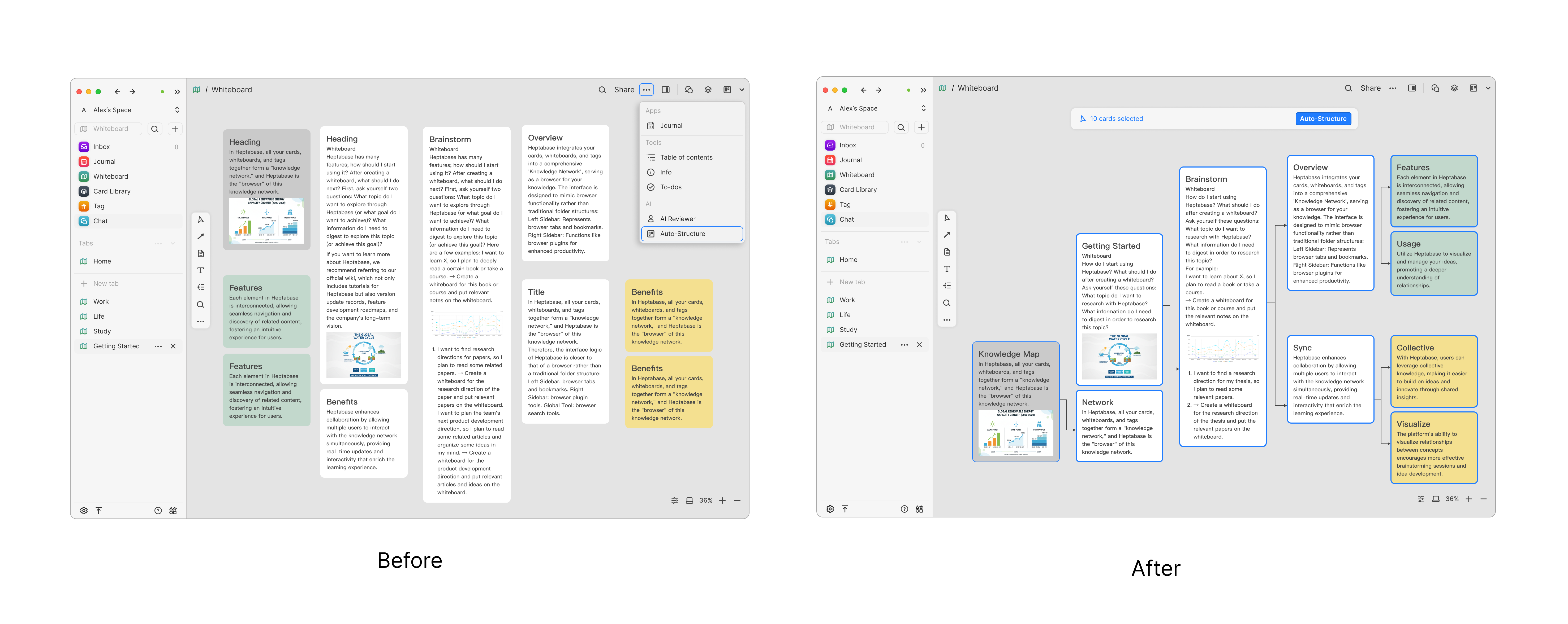
Iteration Design Rationale: From Generic Tutorials to Contextual Nudges
In the first iteration, the new feature was introduced through a tutorial shown when users opened the product. While this approach clearly explained the functionality, I found that many users tended to skip tutorials, resulting in low feature discovery and adoption.
In the second iteration, I rethought when and how guidance should appear. Inspired by the “nudge” approach from Shape of AI, we shifted from upfront instruction to contextual, behavior-based guidance.
Instead of interrupting users at entry, the system now detects a meaningful moment—when more than 10 cards are selected on the whiteboard, signaling a potential need for structure—and surfaces a lightweight UI prompt to introduce Auto-Structure. This allows the feature to appear at the moment of intent, reducing cognitive load while increasing relevance and adoption.
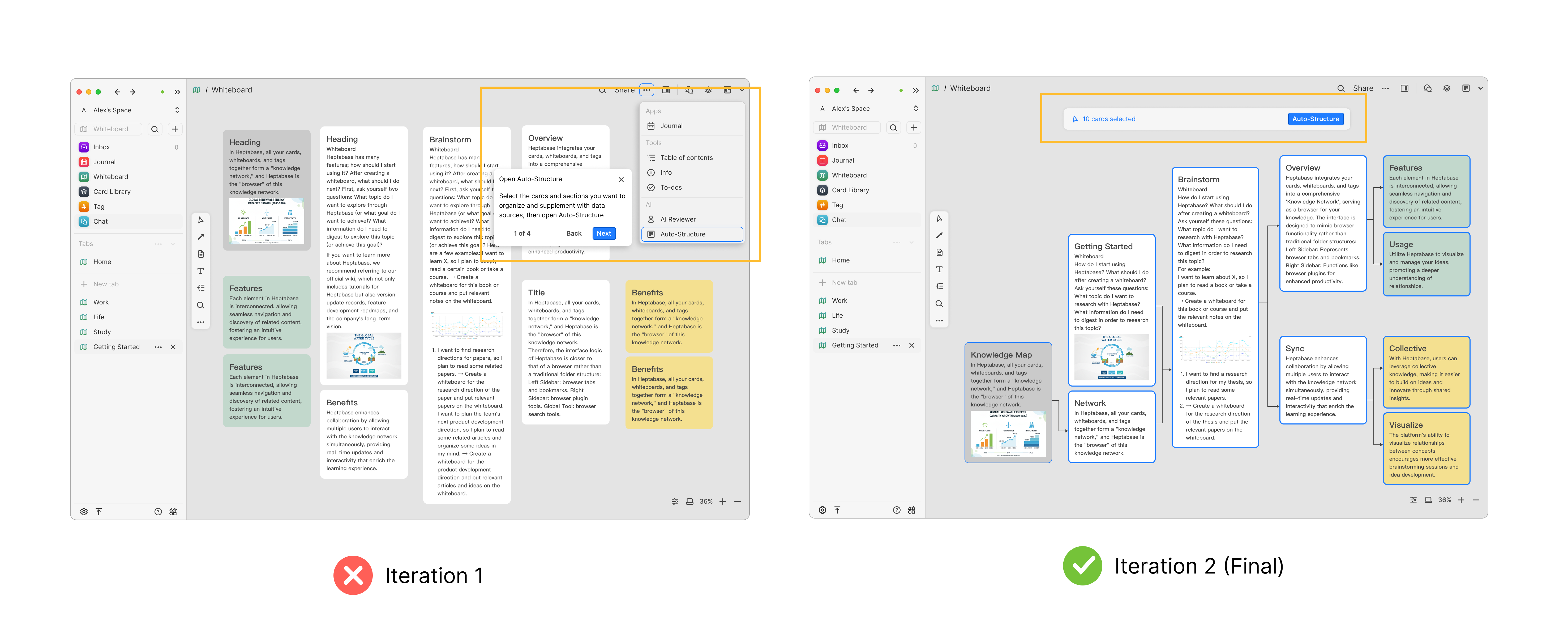
Iteration Design Rationale
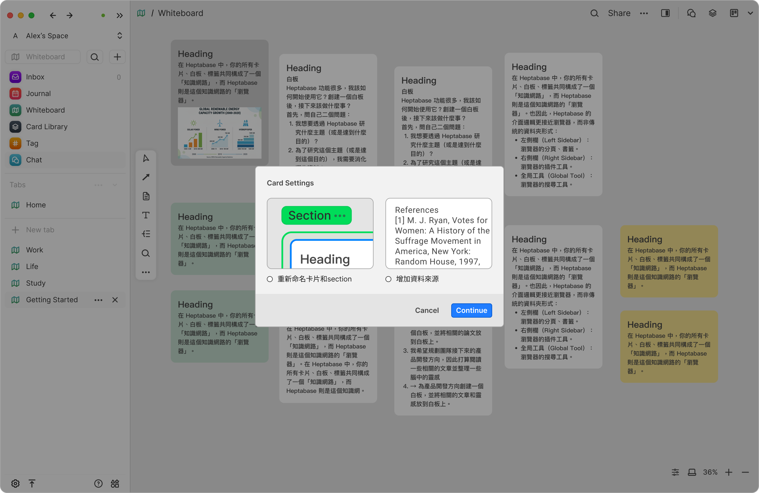
Usability testing showed that separating options like adding data sources and auto-naming sections into an extra step made the flow feel unnecessarily long. Since users perceive these decisions as part of the same structural setup, we merged them into the main configuration flow.
An early version placed all options below the preview, but users struggled to see how structure settings were linked to the preview. In the final iteration, we separated structure-related settings from optional system assistance through clear visual grouping, and used checkboxes for optional actions to reinforce user control. This reduced cognitive load and made the setup feel faster and more intuitive.
Prototype

This app uses the Design system of Noise Eraser including button, input, navigation bar, and checkbox.
Building Alignment Through an Icebreaker Activity
Before the project officially kicked off, I proactively organized a structured icebreaker activity to help the team build psychological safety, rapport, and a shared language.My goal was to ensure everyone felt comfortable collaborating, expressing ideas openly, and understanding each other’s working styles—so that the project could progress smoothly from day one.
Through guided mini-tasks, teammates quickly connected with one another, which later made discussions more efficient and lowered communication friction.
Team Feedback — Positive Outcomes From the Icebreaker Activity

“This is the first time I’ve joined such a well-structured and fun icebreaker. We definitely chose the right team lead!”

“Josie really has leadership presence. We truly picked the right leader. I didn’t know FigJam could be used like this!”
These comments reflect more than appreciation for the activity itself—they show the type of team environment I aim to create:open, collaborative, trusting, and aligned.
Team Feedback — Positive Outcomes From the project
“Thank you, Josie, for your dedicated involvement in the project and for providing thoughtful feedback on the brief and proposal."

“Thanks for your strategic thinking during the interview planning stage and your strong execution in validating assumptions."

“Thanks to Josie for carrying the project."
I’m grateful to have worked with such supportive group. Each teammate brought energy and ownership to the project, and I deeply appreciate the trust they placed in me as a design lead.
1. Real user behavior matters more than verbal descriptions — observe, don’t assumeWhat users say and what they actually do often differ.
Throughout the research, I prioritized observing real interactions over relying on verbal explanations.This helped the team quickly focus on the true pain points.
2. As a Design Lead: leverage each team member’s strengths and allocate resources effectivelyIn cross-functional collaboration, I learned the importance of clarifying each teammate’s skill boundaries early on.
By assigning suitable workloads and providing targeted support, I ensured the team could consistently deliver high-quality outcomes.
3. Usability testing isn’t about perfection — it’s about improving every roundEach small testing cycle should reveal new insights and reduce uncertainty.
These learnings fuel iteration and help the team identify where to focus next — an essential process for maturing a design quickly.
4. Onboarding design: reduce cognitive load and let users feel the value immediatelyA new feature’s first-time experience should be lightweight.
Avoid forcing users to process heavy default content or fill in extra information.With limited time, I applied the “show, don’t tell” principle and used real user input for onboarding validation.Inspired by Shape of AI, I adopted the flow:user’s own content → instant analysis → immediate feedback,so that the value naturally emerges without explanation.
5. Reduce complex task demonstrations — use “task breakpoints” to guide the interviewIf a test requires users to switch between multiple scenarios, they quickly become overwhelmed.
I learned to observe natural reactions during the task, and only add essential context when needed.This approach captures more authentic behavior and clearer feedback.
6. Key realization: great products come from deeply understanding human natureCompetition isn’t about chasing features — it’s about studying users’ real context and motivations.
Only by truly understanding their habits, concerns, expectations, and workflows can a design achieve irreplaceable value.
RecruitmentApp
UXDesign
JobPlatform
TalentMatching
MobileUX
B2BDesign
HRTech
FormOptimization
AITech
AIAudio
NoiseCancellation
WebAppDesign
Sound Design
VoiceEnhancement
B2C Design
CryptoUX
DeFiDesign
PlatformUX
Web3Design
Fintech
CryptoPlatform
B2CDesign
SecurityByDesign