Noise Eraser is an AI-powered noise reduction tool designed for content creators and remote professionals. It delivers fast, hassle-free audio cleanup without the need for manual editing. The product’s core vision is to make noise reduction feel effortless yet trustworthy—addressing common challenges in traditional noise reduction tools such as complex controls and inconsistent results.
Served as the sole designer, designing all UI/UX (wireframe, user flow, UI mockup, prototype)
PM * 1
Android/iOS engineer * 1
Front-end developer * 1
In this AI noise reduction project, our key challenge was: How do we build trust in a system that works instantly yet invisibly?
Unlike traditional manual editing, AI denoising is fast but opaque—users couldn’t tell if it worked, leading to confusion and doubt.
This project aimed to make invisible AI actions visible and understandable—so users could trust and confidently share their results.
↑ 35% Avg. session duration
↓ 22% Bounce rate
↑ 0.61% Total subscription count
↑ 27% Returning user rate


After the product launch, the team aims to enhance it further and gain a better understanding of our users' profiles. At the COO’s recommendation, we initiated a user research phase that included persona development to guide marketing strategies. We also conducted user interviews and usability testing to identify usability issues and inform product iteration.
Research Method :
I was responsible for formulating the interview questions and conducting sessions with six users to explore their behaviors and pain points around noise reduction tools. Collaborating with the PM and user researcher, I compiled the findings, and together we mapped the user journey and developed personas during a workshop.
Key Findings :
1. 66% of users churned due to the inability to clearly perceive the noise reduction effect.
Since the product is new to the market, users are still exploring its functionality. Some videos naturally have minimal noise, making the effects less noticeable.
Without a clear way to demonstrate the feature’s impact, users might misunderstand its effectiveness.
2. 50% of users felt confused due to differences in app and web interfaces.
3. 66% of user are not sure whether our product has auto save function.
4. 33% of user think that the outcome is not aligned with the user’s expectation
Insight :
In the Noise Eraser AI-powered product, we identified a critical user pain point:even though the underlying AI technology effectively removes background noise, users still feel uncertain and hesitant when they cannot see how the system is processing their audio or what has changed as a result.
This uncertainty does not stem from functional failure, but from a lack of perceptible system feedback.When users cannot sense the system’s intervention or clearly understand the outcome, the experience feels like a black box — reducing trust despite technically successful results.
Therefore, my core design insight includes :
1. User trust comes from visible feedback, not silent success
When AI processes run without clear status indicators or visual feedback, users feel confused, uncertain, and are more likely to abandon the experience — even if the outcome is technically correct.
2. Making the invisible perceptible is a core design responsibility
Noise removal is a technical operation, but users judge its success through what they can perceive.When system actions are not clearly communicated, confidence and retention quickly drop.
3. UX is not just about aesthetics — it makes system behavior understandable
Clear processing states, real-time feedback, and before-and-after comparisons reduce the “black box” feeling of AI, helping users build trust and feel in control rather than anxious.

We also conducted a usability test and user research, during which I was responsible for interviewing users. Based on the findings, I summarized the following four key issues:
1. Users are unsure about the usage status → Lack of real-time feedback leads to a gap in user experience.
2. Inconsistent UI/UX between the app and web versions → Increases the learning curve and affects user retention.
3.Unclear file-saving status → Creates uncertainty, disrupting the workflow.
4. The outcome is not aligned with the user’s expectation→ Reduces productivity and lowers conversion rates.


1.2. Noise Reduction Feature Analysis
Noise reduction effectiveness varies depending on the video. Some files show little difference before and after processing, making it hard for users to perceive its impact.
This may lead users to believe that the product is ineffective, potentially resulting in user loss.

1.3.Voice and Background Sound Adjustment
If both voice and background sound are set to the same value, no reduction occurs, which may further reinforce the perception that the product is not working as expected.

1.4.Customization & Adjustability
In the APP, the Voice/Noise Ratio Bar is only available in the Custom mode.
On the Web, users can adjust the settings for each default preset.
Since the product is new to the market, users are still exploring its functionality. Some videos naturally have minimal noise, making the effects less noticeable. Without a clear way to demonstrate the feature’s impact, users might misunderstand its effectiveness.

Users said if a large number of files need to be downloaded, it is preferable to rename the files during the editing process for easier organization after downloading. Renaming the files only at the time of downloading would require individually checking each file, which is more cumbersome.
Currently, it can only be modified on the APP.
Inconsistent default icons and premium badges (crown icon) between the APP and the Web.

While users edit the file, they are not sure whether the file will be saved with the currently adjusted background sound and voice ratio or not.

When users complete adjusting the audio and share the link with others, they anticipate the shared page will reflect their real-time noise reduction settings.
However, instead of displaying the user's specific adjustments, we provide a before-and-after comparison showcasing our noise reduction capabilities. This approach allows us to highlight our expertise in noise reduction on this webpage.

When sharing a link, the default setting of the dropdown menu is set up in "private" which doesn't align with the mindset of users who already want to share it with others.
Users often feel uncertain or anxious when sharing meeting content automatically. They lack control over what is shared, when, and to whom. This causes hesitation and may reduce engagement with automated productivity tools.
Our goal is to design a more transparent, customizable, and trustworthy sharing experience that aligns with users’ mental models and boosts adoption.
This redesign focused on three main goals:
(1) Reduce ambiguity in how the denoising works,
(2) Offer users both default simplicity and advanced control,
(3) Build user confidence in the system through clear status feedback and shareability.

Remove the play button from the thumbnail.Instead, use clear status labels such as “Processing,” “Edit,” or “Complete.”
We prioritized clarity and trust over offering early playback interaction.
Noise Control: Combining Presets with Custom Flexibility


Add the edit function of the file name.
Make the prime icon the same between different platforms.

I refer to Canva and Google Slides which are popular editing tools, and I found that they use tooltips to help users understand the icon's function.
To decrease the user's learning curve, I follow their solution. When users hover over the background and voice icon, a tooltip notification appears above the icons on the web. Moreover, as for the mobile version, it will show the tooltip for several seconds when the users jump to this page.
When users click the different buttons, a tooltip notification appears on the video to inform the user of the currently used filter.
Validation:
This solution aligns with established UX best practices (e.g., Nielsen Norman Group’s heuristics).


"In testing, 4 out of 5 users said they preferred sharing their custom result over the system-recommended one."


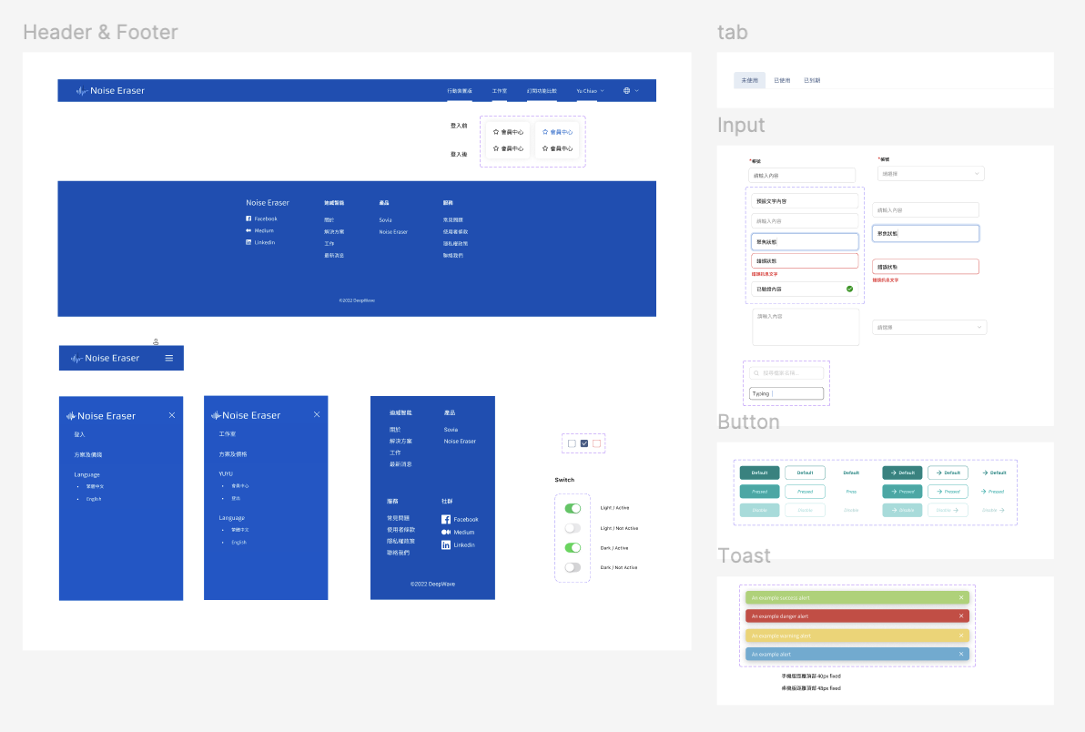
As a startup, the team lacked a shared component library. Designers had to search across multiple files to reuse UI elements, resulting in inconsistent patterns, duplicated work, and slower iteration cycles.
Recognizing this as a scaling risk, I proactively built the company’s Design System from scratch, establishing a shared component library as a single source of truth.The goal was not visual polish, but operational efficiency, consistency, and faster delivery.
By standardizing reusable components and patterns, the team reduced repetitive work, improved product consistency, and accelerated design and cross-team collaboration — allowing designers to focus on solving real product problems instead of recreating UI.


Although key usage metrics showed positive growth post-launch, overall revenue remains below expectations. To strengthen monetization and capture long-term value, I proposed the following future initiatives:
1. Introduce Tiered Pricing & Freemium Model
2. In-App Upsell Touchpoints
3. Launch Team/Business Plan (B2B Use Case)
Key Metrics to Track
This project strengthened my ability to translate complex AI technology into intuitive, benefit-driven experiences for both end users and business stakeholders. Beyond interface design, it became a deep exercise in cross-functional collaboration and design strategy.
RecruitmentApp
UXDesign
JobPlatform
TalentMatching
MobileUX
B2BDesign
HRTech
FormOptimization
UserResearch
CryptoUX
UXDesign
Notetaking
AIForThinking
B2CDesign
AIAgent
KnowledgeManagement
CryptoUX
DeFiDesign
PlatformUX
Web3Design
Fintech
CryptoPlatform
B2CDesign
SecurityByDesign