The project centers around RemixDAO, a Web3 investment platform designed to help users discover, evaluate, and participate in early-stage crypto projects. Unlike traditional exchanges, RemixDAO focuses on community-driven investment, where users can track project roadmaps, contribute to governance decisions, and manage their portfolios—all in one place.
However, during usability evaluations and heuristic reviews, we identified several issues that hindered user trust and engagement, especially for newcomers to the Web3 space. These included unclear value propositions, fragmented user journeys, and inconsistent UI patterns.
To address these gaps, our redesign aimed to improve information clarity, investment accessibility, and visual trust, while supporting a diverse user base ranging from experienced crypto users to Web3-curious beginners.
Enhance usability, clarity, and trust across principal user flows, including login, dashboard, and investment interfaces.
I was the sole designer responsible for all UI/UX work (wireframe, user flow, UI mockup, prototype)
Product Designer * 1
full-stack Engineer * 1
PM * 1
With only three months, I had to independently identify issues and deliver a design iteration. The team had limited UX knowledge and no research resources. The original system lacked structure and clarity, requiring me to redefine the module’s purpose and flow.
RemixDAO is a strategy platform designed for crypto investors, serving a diverse user base—from beginners entering Web3, to traditional finance investors, to advanced on-chain users. The product’s core features include strategy participation, performance tracking, community-based leaderboards, and multi-chain asset management. The goal is to build a modular experience that fosters transparency and user motivation.However, the original product posed several usability challenges that hindered user understanding and retention:
1. Internal Interviews
I conducted interviews with the CEO, marketing lead, and community manager to understand our core user segments:
These conversations also revealed the importance of the Club module in motivating users through team performance and referral-based earnings—yet its current design failed to support this purpose effectively.
2. Heuristic Evaluation
Since we couldn’t directly test with users, I applied Nielsen Norman Group’s 10 usability heuristics to identify major UX issues:
Before
After
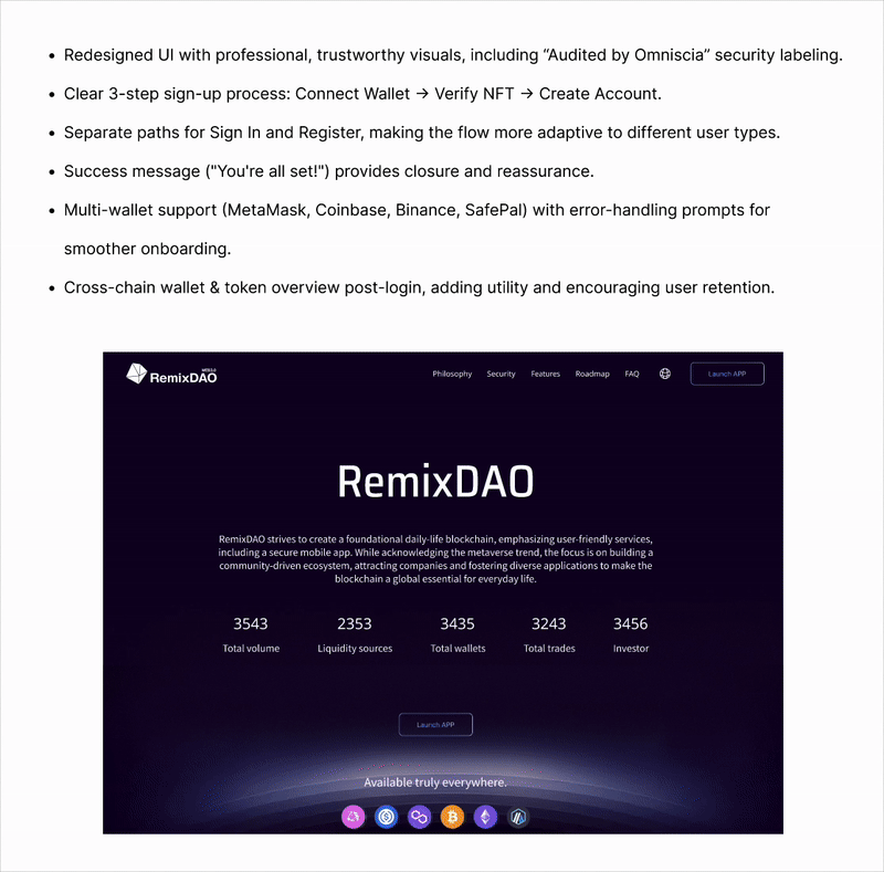
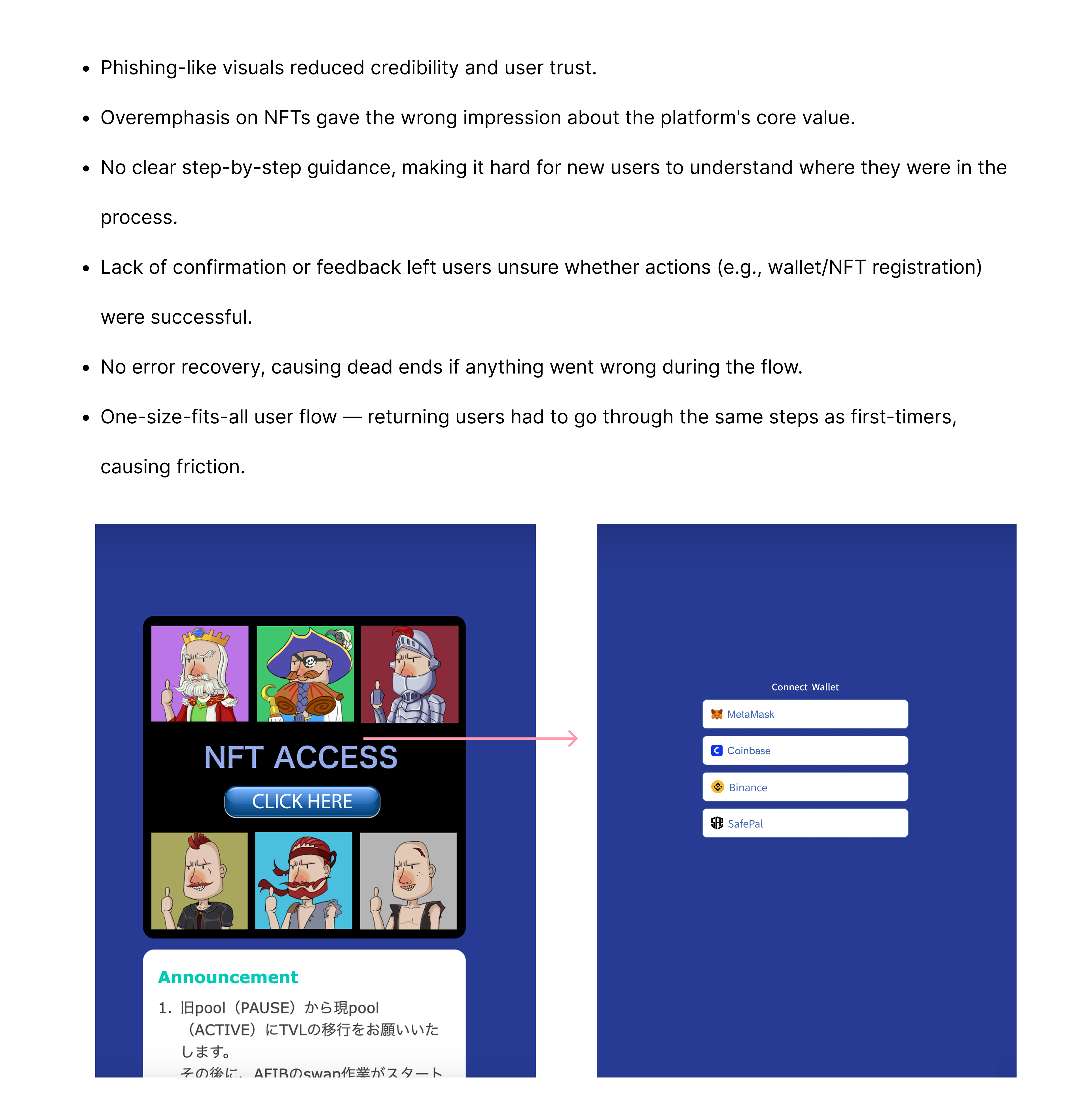
1. Landing Page
.gif)
2. Sign in

Prototype

Before
After
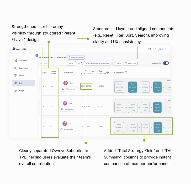
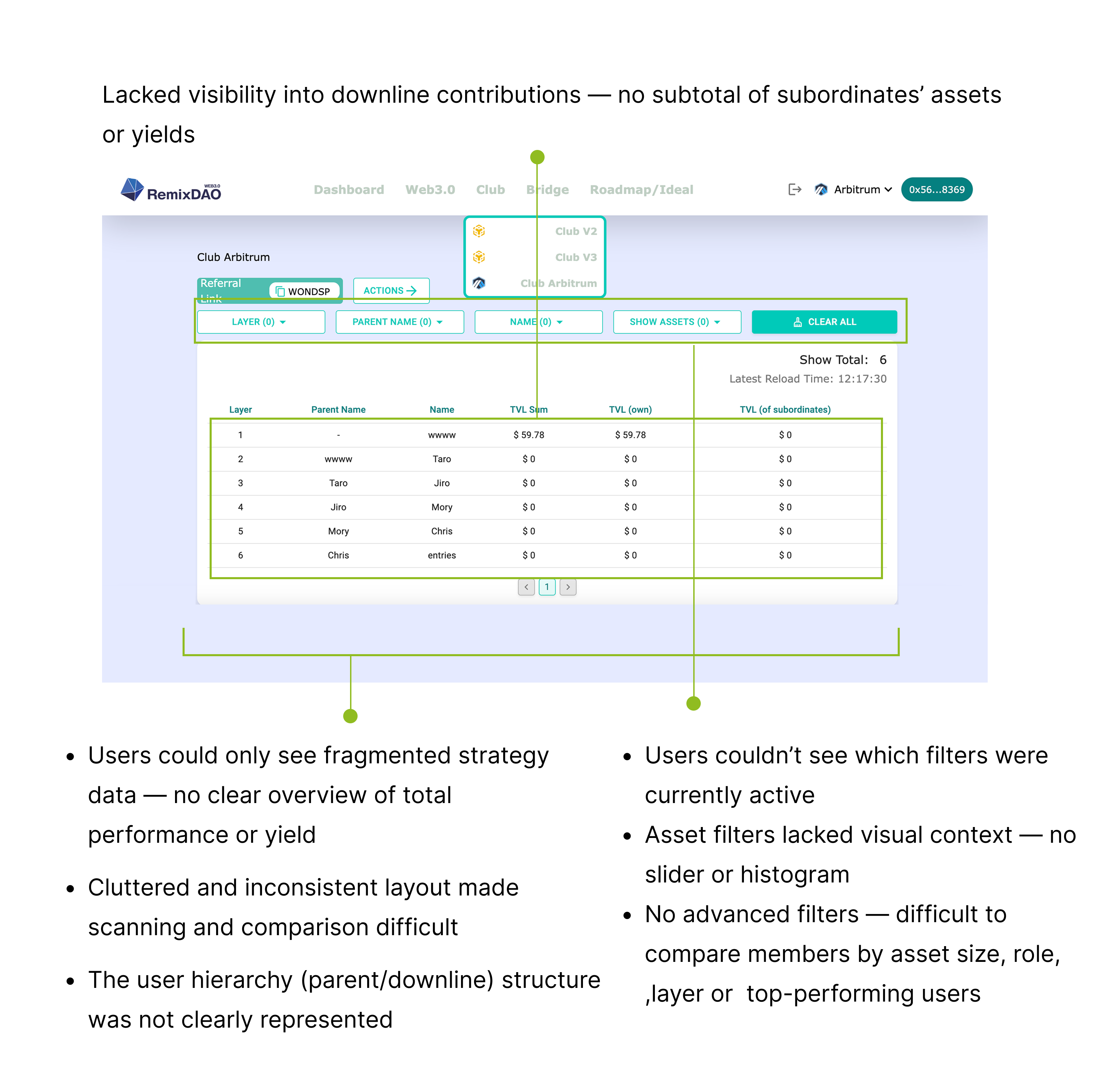
1. Modular Card Layout for Performance Comparison
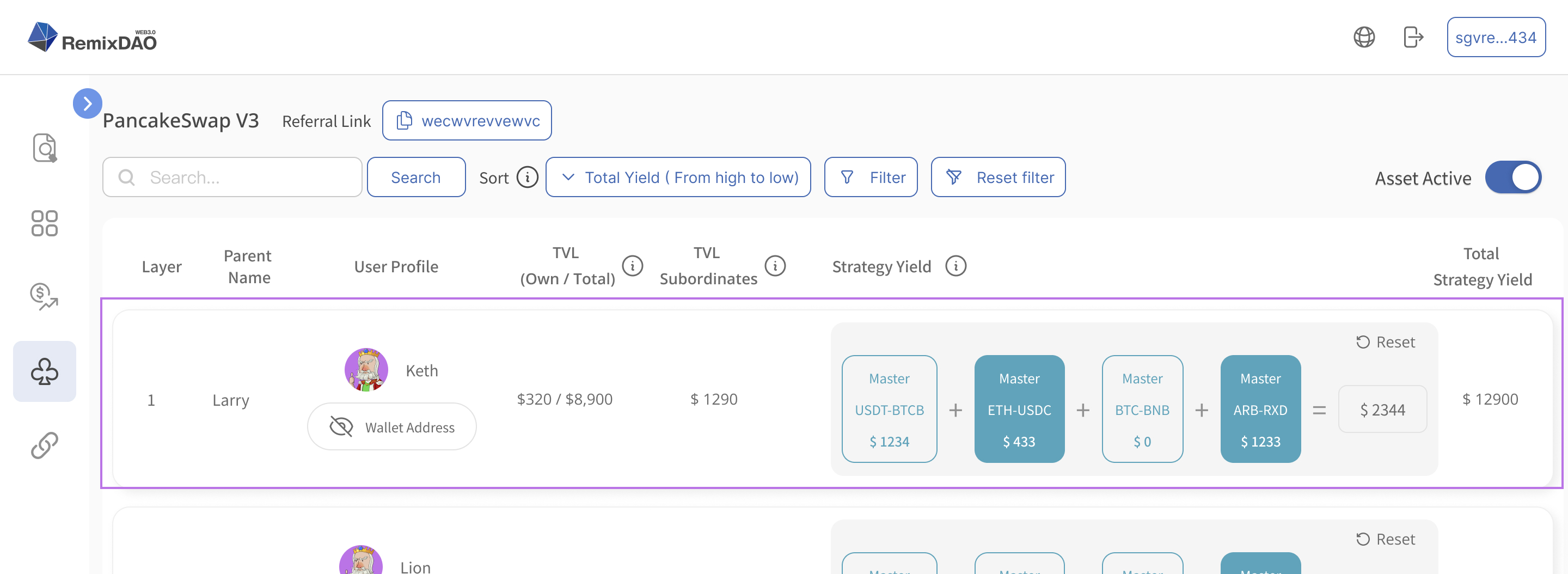
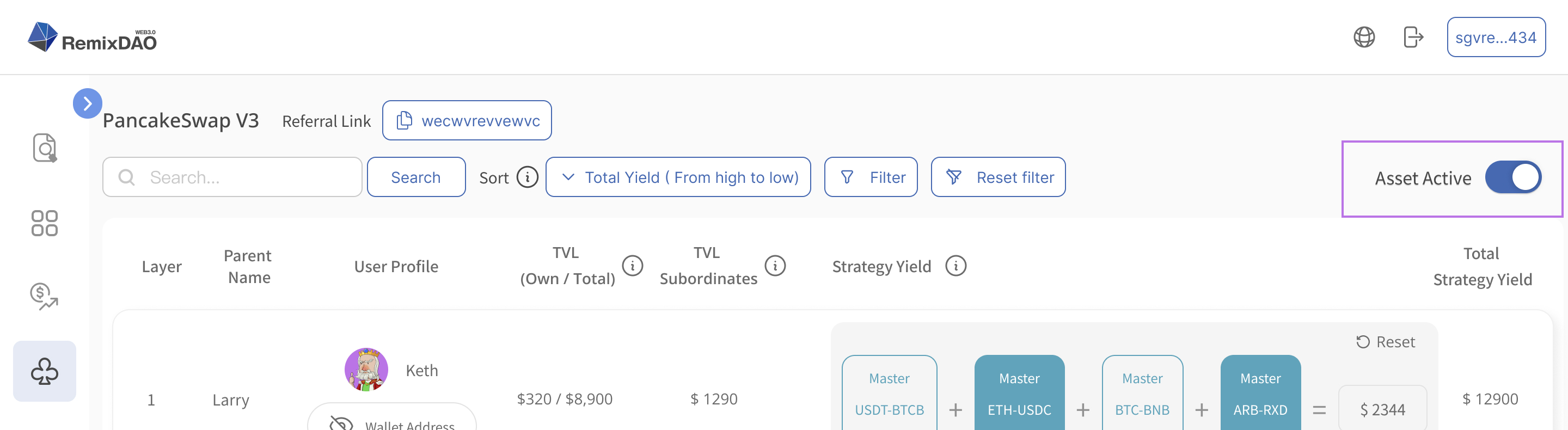
2. Grouped Display by Status: Active vs. Inactive Strategies
3. Advanced Filter Panel with Hierarchy, Range & Multi-Condition Support
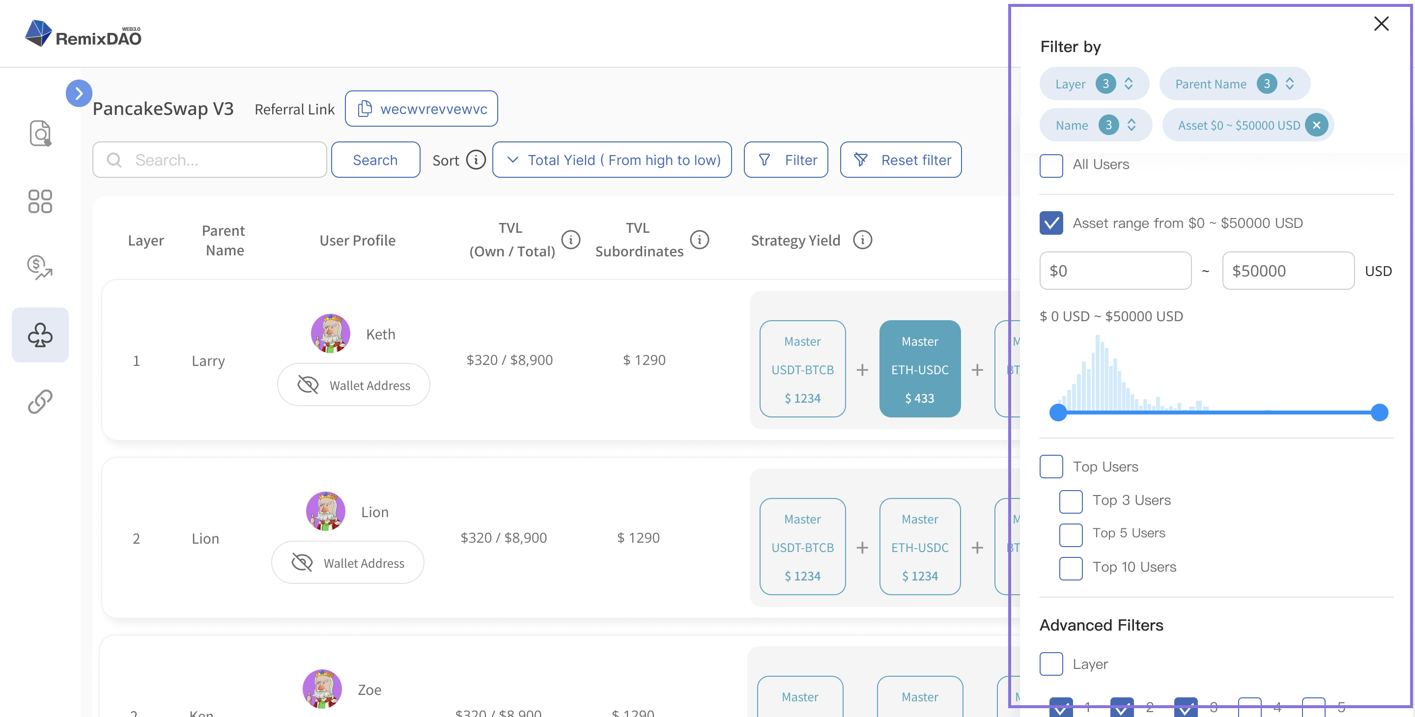
Benchmarks:
I drew inspiration from Dune Analytics and Amazon Seller Central for multi-condition filter layout, and from LinkedIn Recruiter and Figma Team Browser for hierarchical search patterns and visual range sliders paired with data context.
Prototype

Before
After
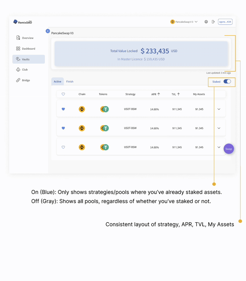
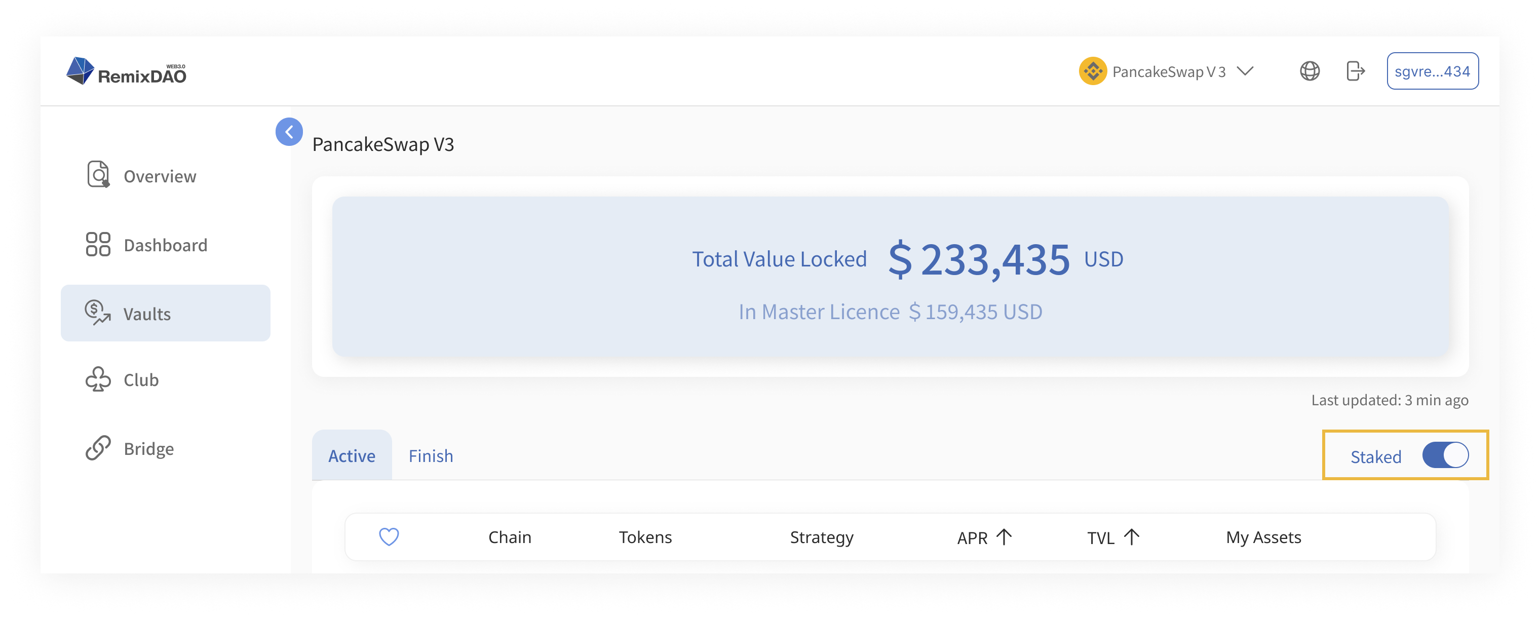
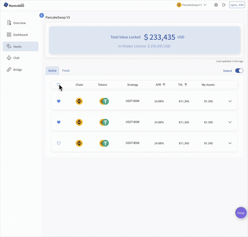
1. Improving Vault Usability with a Staked Filter
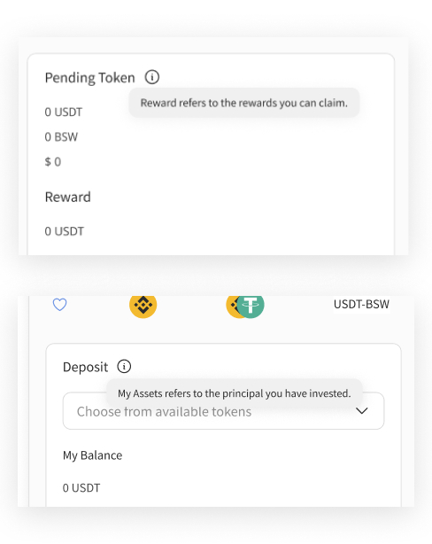
2. Clarifying Web3 Jargon with Just-in-Time Tooltips
Prototype
To evaluate whether the redesign achieved its goal, I defined the following success indicators:


Project Background & Problem Analysis
How I Identified These Issues
Module 1: Login & Landing Page — Crafting a Trustworthy First Impression
Module 2: Club — Performance Visibility and Social Motivation
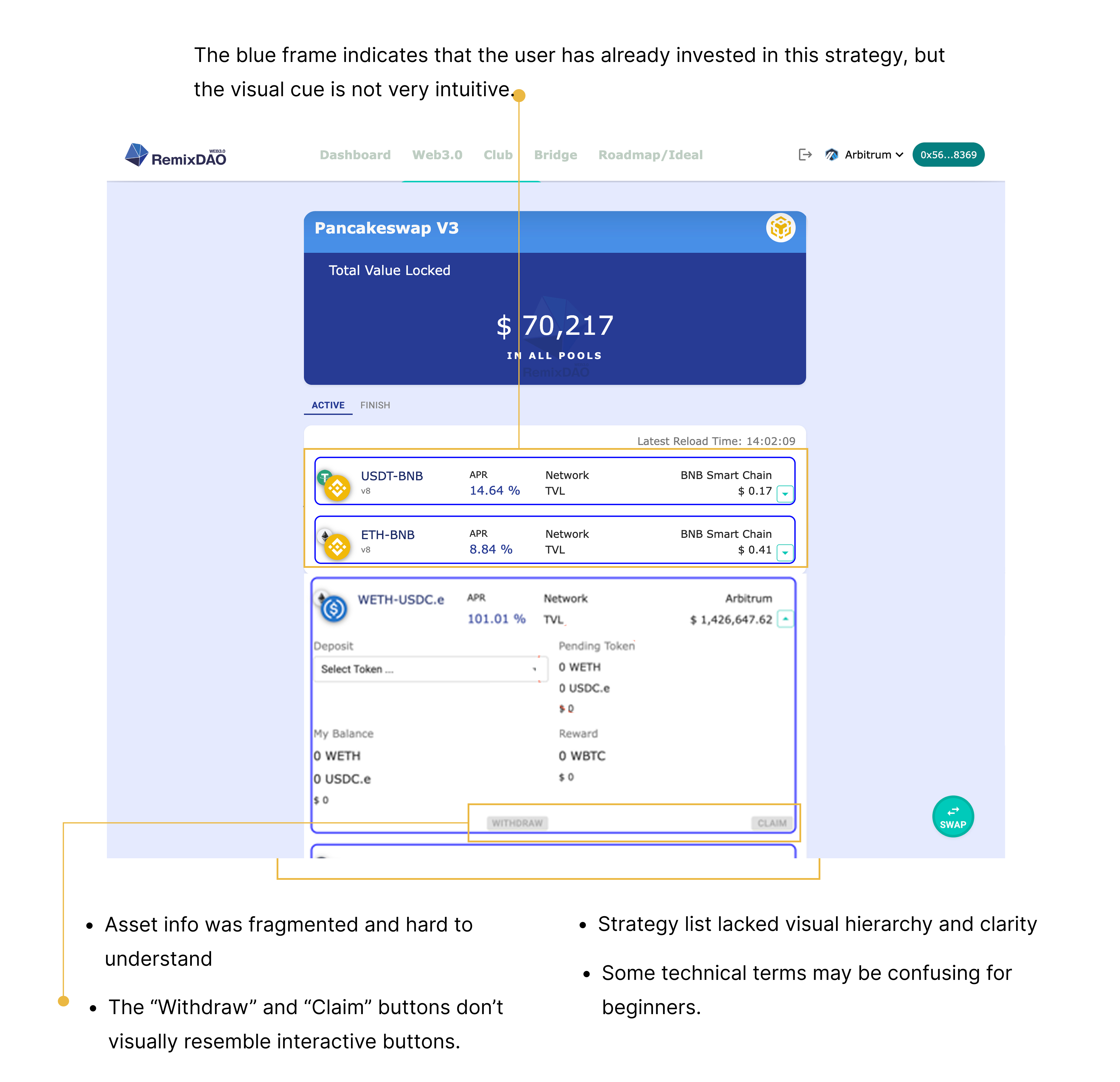
Module 3: Vaults – Making Strategy Execution Clear and Confident
Success Metrics
Design System
UI Mockup
Takeaway
AI Tech
AIAudio
NoiseCancellation
Web App Design
SoundDesign
Voice Enhancement
B2CDesign
RecruitmentApp
UXDesign
JobPlatform
TalentMatching
MobileUX
HR Tech
FormOptimization
B2BDesign