The company’s existing recruitment system had not been updated for years — its outdated interface and cumbersome workflows no longer met the needs of modern HR users. The CTO decided to completely revamp the UI, aiming to deliver a more attractive, user-friendly, and scalable system within a tight six-month timeline. The project required close internal collaboration with PMs and engineers, as well as external presentations of the design solution to the customer service team, making it a multi-faceted and challenging initiative.
Although the project was initially positioned as a UI beautification task, my evaluation of the existing product revealed several usability and workflow issues that directly impacted HR professionals’ daily operations. With only a six-month timeline and limited UX maturity within the company, I had to work within significant constraints.
Moreover, according to the company’s roadmap, the App was prioritized as the primary platform, with the Web version planned to follow based on the App’s structure.
Sole designer leading all UI/UX efforts (wireframe, user flow, UI mockup, prototype), working with one iOS engineer, one Android engineer, an outsourced project manager, and a junior PM.
Completed a 6-month product redesign as a solo designer under tight constraints and limited user access, in a low-maturity UX environment with evolving processes.
The CTO openly disagreed with traditional UX research methods, believing they were time-consuming and would not prevent user complaints. Under these conditions, I conducted an internal interview with the CTO who is familair with users to better understand our user profiles.
Due to limited access to end users, I adopted low-cost UX research approaches. I applied cognitive walkthroughs to analyze task flows and user decision points, and mapped the findings against Nielsen’s usability heuristics to assess usability risks. This approach allows us to systematically identify key usability gaps without relying on direct user testing.
While this approach does not replace user validation, it helps reduce design risk and informs iteration priorities until user testing becomes available.
I recruited several people and ask them to finish the tasks. After that, I identified several UX issues, and synthesized them into a user journey map to clearly communicate insights with stakeholders.
CTO mentioned that customer service frequently receives complaints from users who struggle to navigate the app—particularly small business owners from traditional industries who are not familiar with digital tools. Based on these insights and the mapped user journey, I identified two key personas:
Persona 1: May Chang
Role: Small Business Owner
Goals: Hire quickly, minimal effort, easy-to-use tool
Pain Points:
Persona 2: Kevin Lin
Role: HR Manager (Mid-sized company)
Goals: Streamline hiring, track applicant status, generate reports
Pain Points:
Users felt difficult to find the right resumes, and posting jobs made them feel like filling out taxes.
The recruitment platform had grown cluttered over time. Key tasks like posting jobs, searching resumes, and managing interviews were inefficient, leading to recruiter fatigue and lost candidates.
During stakeholder interviews, the CTO shared that HR clients struggled to review resumes efficiently.
This pointed to major usability issues in the search results experience:
These issues caused unnecessary friction, wasted time, and reduced recruiter confidence in the platform’s ability to support fast, high-quality hiring decisions.


During an internal interview, the CTO mentioned that customer support had received complaints from users—many recruiters were frustrated that they weren’t getting enough applications, even for seemingly attractive job posts.
Over time, this frustration doesn’t just affect hiring performance—it also risks damaging the customer’s perception of our product’s value.
If recruiters feel that the platform cannot help them attract the right candidates, they may lose confidence in the service and hesitate to renew or upgrade their plan, ultimately impacting client retention and revenue growth.
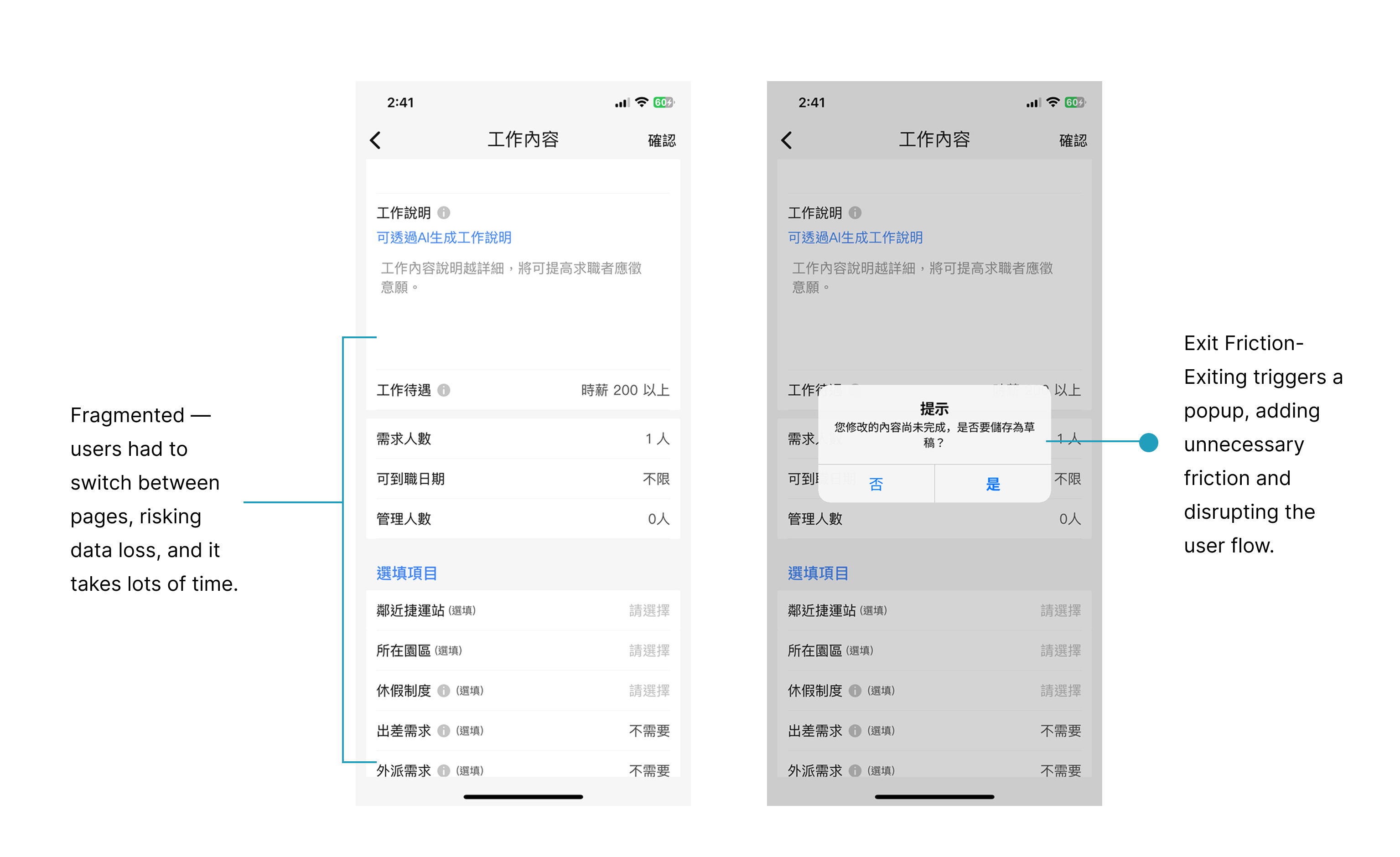
The search and job posting flow was fragmented, inefficient, and lacked smart filtering—causing friction, wasted time, and poor user clarity.
To solve the fragmented experience, I focused on three key areas.
%20(1).gif)
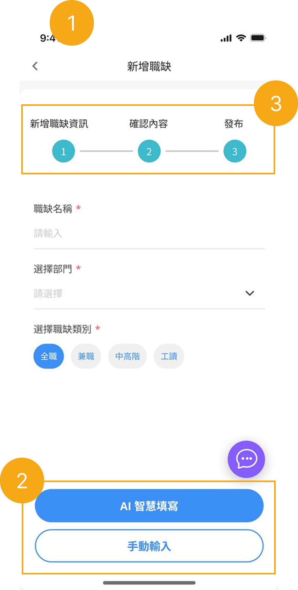
Optimizing Job Posting Flow with Smart Form Design & AI Assistance
To streamline the job posting experience, I introduced a single-page form layout, AI autofill with manual editing, and a step-by-step progress bar—balancing speed, clarity, and control.
Single-Page Form vs. Stepper Flow
AI Autofill + Manual Editing
Shallow Progress Bar for AI Feature Adoption
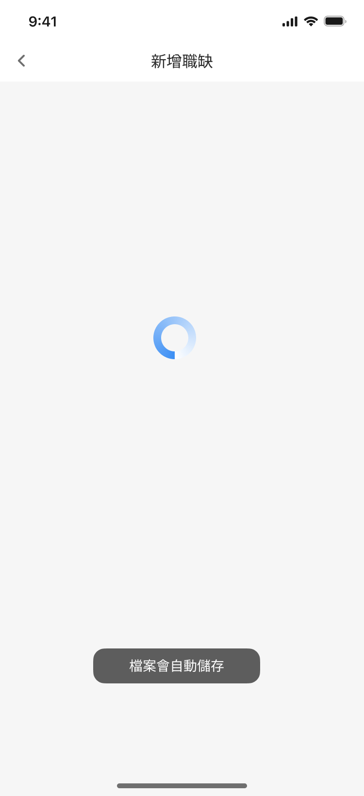
Autosave to Reduce Drop-Off and Friction
.gif)
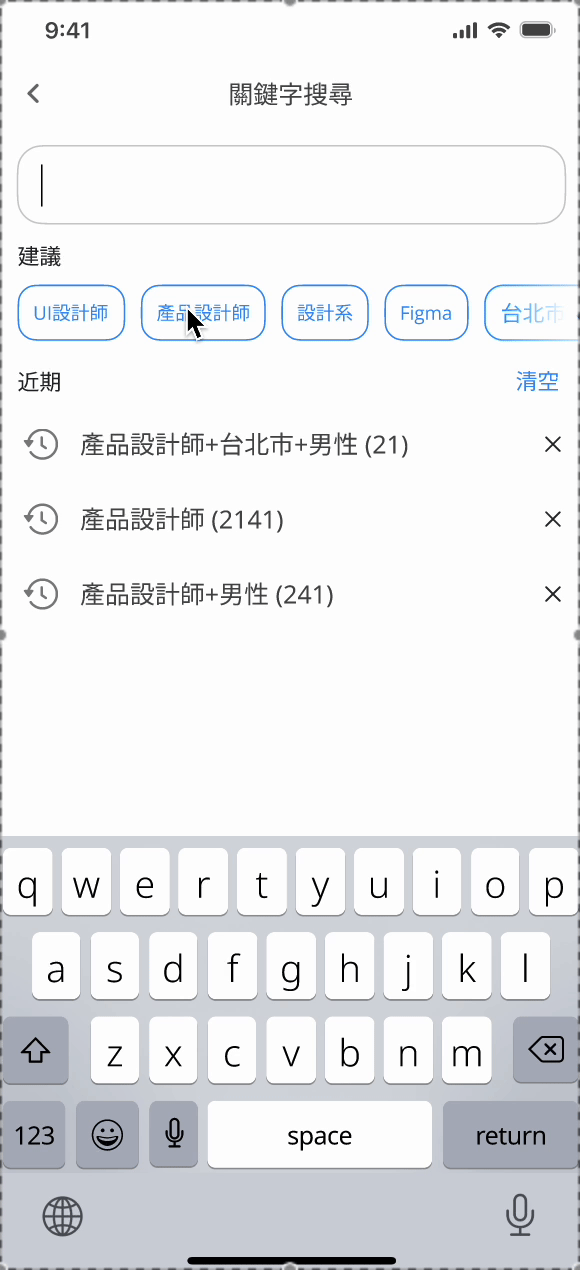
To streamline the search experience, I redesigned the filtering system with three key improvements—chip-based filtering, horizontal scroll layout, and fuzzy search—guided by proven UX patterns from Shopee, Google, and Amazon.
1. Chip-Based Filtering with Real-Time Suggestions
I replaced dropdowns with real-time suggestions and chip-based filters to simplify user input and adjustment.
2. Horizontal Scrollable Filter Layout
I used a horizontal scrollable chip row to allow compact, intuitive access to filters without overwhelming the UI.
3. Fuzzy Search with Keyword Ranking
I implemented fuzzy matching and keyword ranking based on popularity and historical queries to reduce zero-result searches.
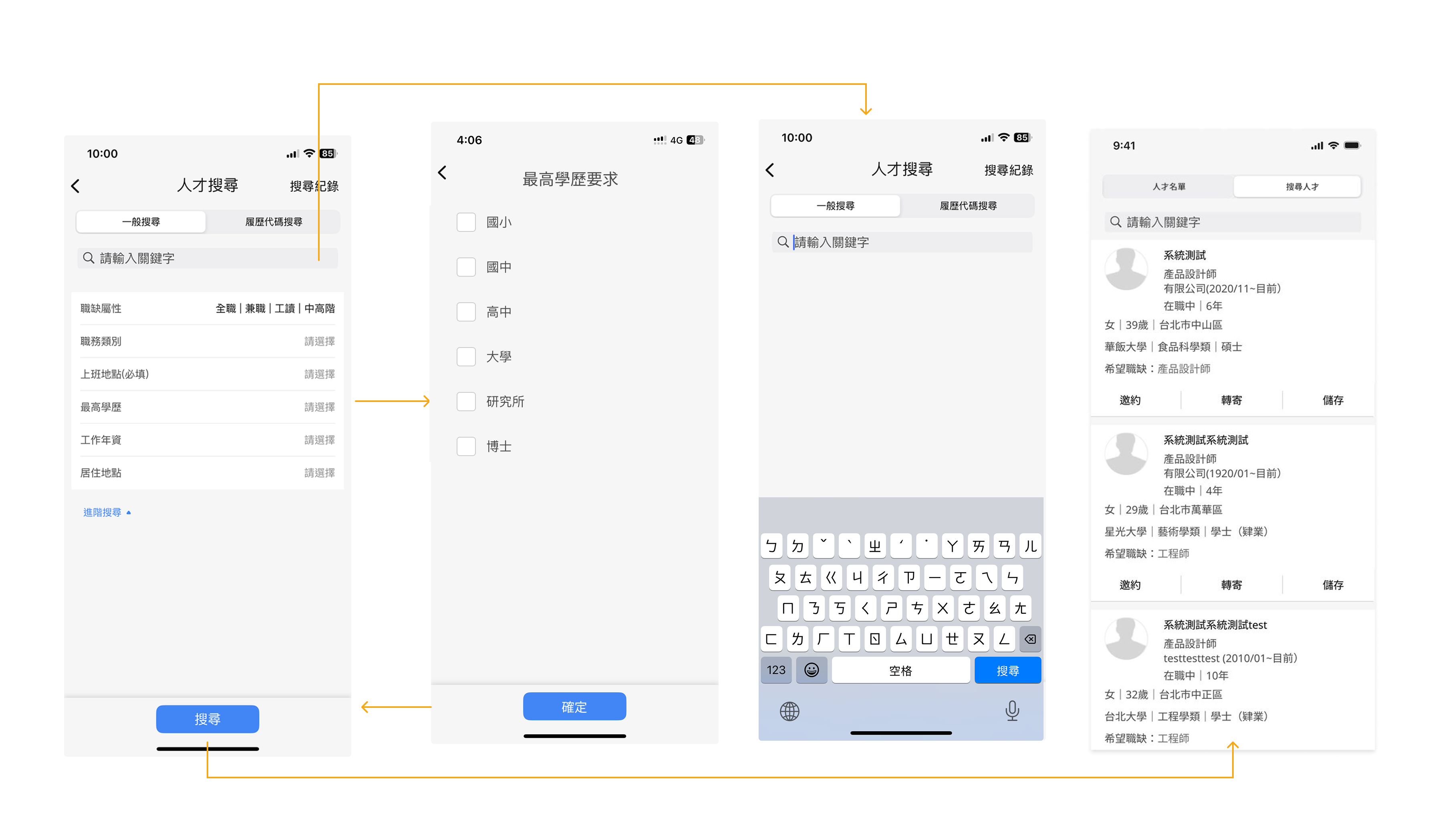
2.2. Advanced Searching & Resume Matching System
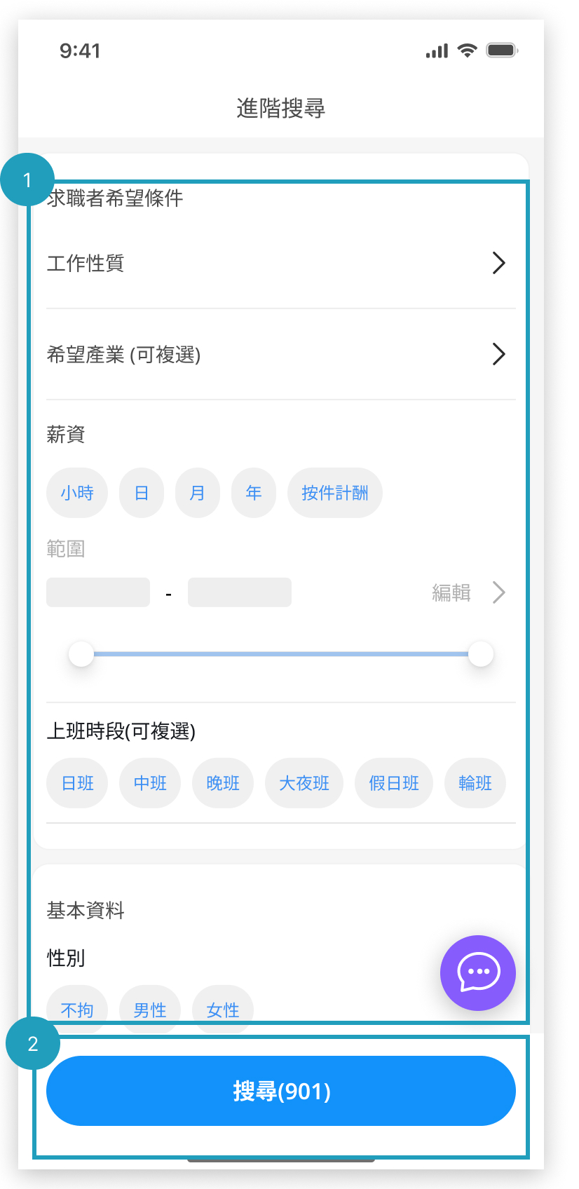
To improve the resume search and evaluation experience, I designed an Advanced Searching & Resume Matching System that integrates real-time result counts, AI-powered matching scores, and horizontally scrollable resume cards. These features collectively aim to enhance decision speed, clarity, and fairness in high-volume screening environments.
Streamlined Filter UI for HR Talent Search
To enhance the efficiency of HR professionals in locating suitable candidates, I redesigned the advanced search panel with chip-based filtering, flexible salary input, and a single-page layout.
This design allows HR users to scan, adjust, and confirm filters without leaving the current screen—ideal for time-sensitive recruitment tasks.
Real-Time Filtered Results Count
Instead of relying on a traditional "Search" button, I implemented a real-time result count that updates dynamically with each filter adjustment.
2.2. AI-Powered Resume Matching System
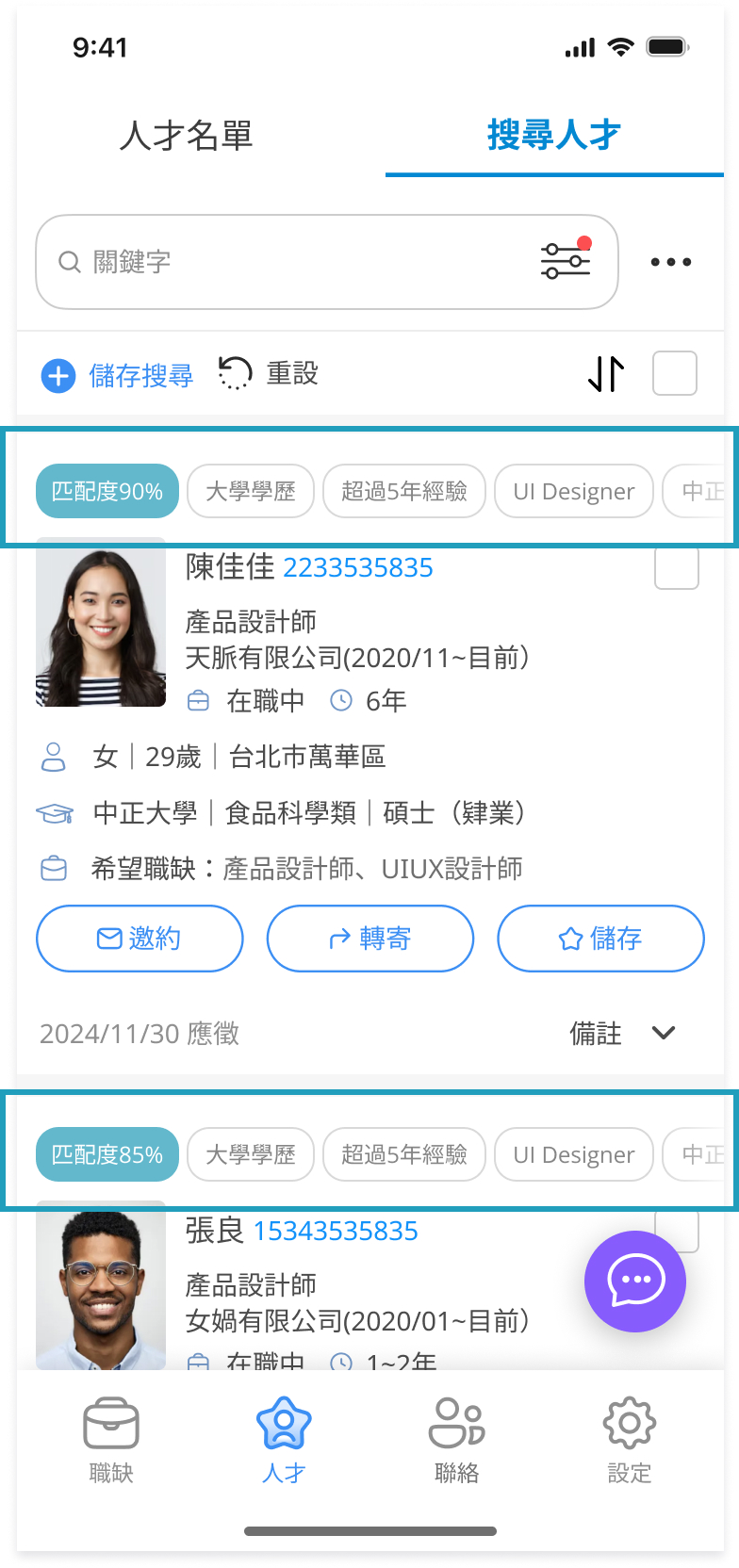
I incorporated AI match scores and visual tags to help HR quickly identify top candidates without needing to open every profile.
Prototype
.gif)
2.3. Enhancing HR Efficiency: Smart Filtering System
.gif)
To support fast, high-volume screening, I designed a filtering system with a "Hide Viewed" toggle, bottom sheet filters, and persistent match scores—all integrated into the list view.
To improve usability and reduce cognitive load, I refined the UI using Jakob Nielsen’s 10 usability heuristics, focusing on layout clarity, consistent structure, and visual priority cues.
I believe that building influence in an organization requires accumulating small wins. Instead of insisting on large-scale reforms or full research cycles, I focused on incremental improvements that could quickly demonstrate value. This approach helped build trust in design, gradually earn more resources, and provided me with valuable experience in iterative redesign.
At this stage, we needed to prepare a comprehensive briefing for customer support, and the the outsourced PM proposed delivering the full redesign upfront. However, because our user base was large, a sudden overhaul risked alienating existing users. I therefore recommended a progressive rollout strategy—prioritizing features by usage frequency and revenue impact. This balanced risk management with design value, ensuring the most impactful changes reached users first.
Proposed rollout sequence:Medium frequency, high revenue impact: Candidate Search / Sourcing → Scheduling (Interview Scheduling) → Job Posting → Progress Reporting
High frequency, high revenue impact : Resume Screening
To evaluate whether the redesign achieved its goal, I defined the following success indicators:
1. Resume Screening Time ↓
Recruiters should be able to review resumes more efficiently. A lower average time spent per resume reflects improved interface clarity and decision support.
2. Incomplete Draft Interruption Rate ↓
The auto-save function should significantly reduce data loss and frustration from accidental exits. A drop in interruption incidents indicates improved flow resilience.
3. HR Satisfaction Score ↑
Post-redesign usability testing should yield a higher satisfaction score, validating whether the redesign meets HR needs and expectations.
4. Job Post Completion Rate ↑
More users should be able to smoothly complete and publish job listings. A higher conversion rate from draft to published post reflects improved usability and guidance.
5. Application Rate per Job ↑
Better layout and information hierarchy on job detail pages should encourage more applicants to apply. A rise in average applications per job post indicates improved engagement and content clarity.
Due to limited resources, I lean toward adopt cost-effective and lightweight validation methods to ensure the redesign addressed core usability issues at first:


Although this project was ultimately not launched due to company-level decisions, and we couldn’t track its real-world performance, the process revealed many areas for improvement and left a few regrets. Still, it became a valuable learning experience that significantly sharpened my UX judgment and design communication skills.
Here’s what I gained from this journey:
AI Tech
AIAudio
NoiseCancellation
Web App Design
SoundDesign
Voice Enhancement
B2CDesign