The company was newly established—just one to two years in—and was positioning itself to become the “Adobe of audio.” To support this vision, we set out to build a centralized Account Center that would allow users to easily view and manage the audio products they had purchased. Beyond streamlining user access, the platform also served a strategic purpose: to collect user data, understand user profiles, and enable cross-product data integration for future business analysis and growth planning.
To build a centralized Account Center that enables users to manage their purchased audio products in one place, while also supporting the company’s long-term strategy by collecting user insights, enabling cross-product data integration, and laying the foundation for business analytics and personalized growth opportunities.
I was the sole product designer responsible for leading the end-to-end UX/UI design of the Account Center. I collaborated closely with one PM and one iO and Android engineers to define product requirements, shape the information architecture, and ensure a scalable and user-friendly interface.
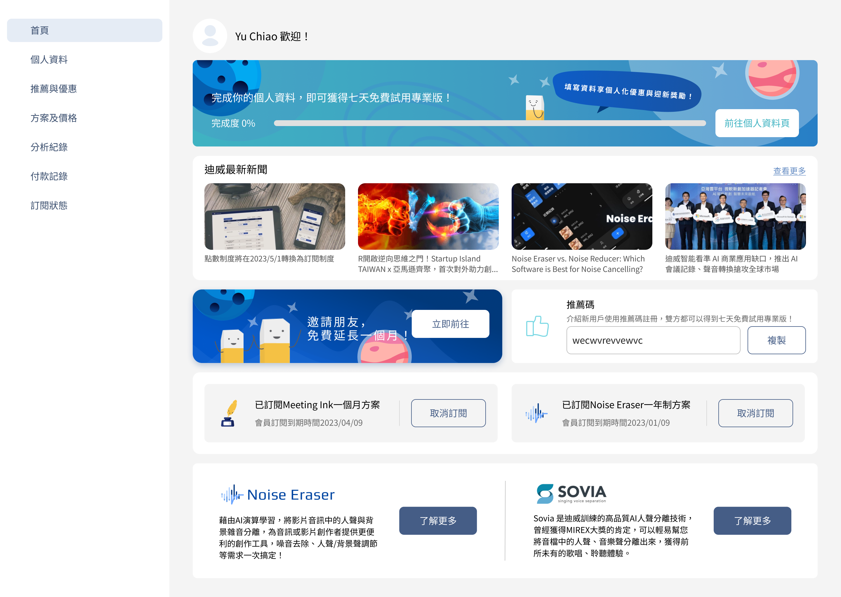
Evolved from a simple login portal, the Account Center needed to unify fragmented user experiences across multiple products and scale into a central hub for managing accounts, subscriptions, and usage.
- 30% Onboarding and account setup time
+ 13% Number of Users
+ 3.2 % User engagement
+ 4% increase in 7-day active retention rate
Get to know more about persona, user journey and their pain point
Define questions and problems
Figure out the solution
Validate ideas(Tracking data & User Interview & Usibility Test)
As a startup, the company needed to build the product from the ground up. The original version was quite basic and lacked many key features commonly found in more established account centers.
Due to the limited resources, we didn’t conduct direct user interviews for this project. To solve these problems, PM analyzed internal performance metrics and I benchmarked against leading platforms to uncover key experience gaps in our Member Center. Our PM pointed out that:
I compared our product with platforms like LINE Points, Shopee, Adoble, and Netflix, which share common best practices:
Based on these inputs, we synthesized the following five four problem areas, prioritized by their frequency of mention and potential business impact.
1. Information is hard to scan due to unclear visual hierarchy.


2. Missing Incentive Mechanisms Due to Absent Reward Display

Users lacked motivation to explore or engage with the Member Center because no visible rewards, tasks, or progress cues were provided. Without clear indications of what users could gain (e.g., coupons, referral rewards, or upgrade benefits), they had no reason to return.
3. No personalized display based on membership level or user behavior
The membership center lacks personalized experiences and fails to recommend suitable products or services based on user behavior. There is no tailored promotion or notification system based on user preferences, reducing incentives for purchases and renewals. The absence of interactive features discourages users from revisiting the membership center, negatively impacting retention rates.
To enable personalization, we first need to collect user data—so it’s essential to motivate users to complete the input fields. But the previous version had some problems:
page.png)
4. Lack of task incentives or prompts, resulting in low user motivation
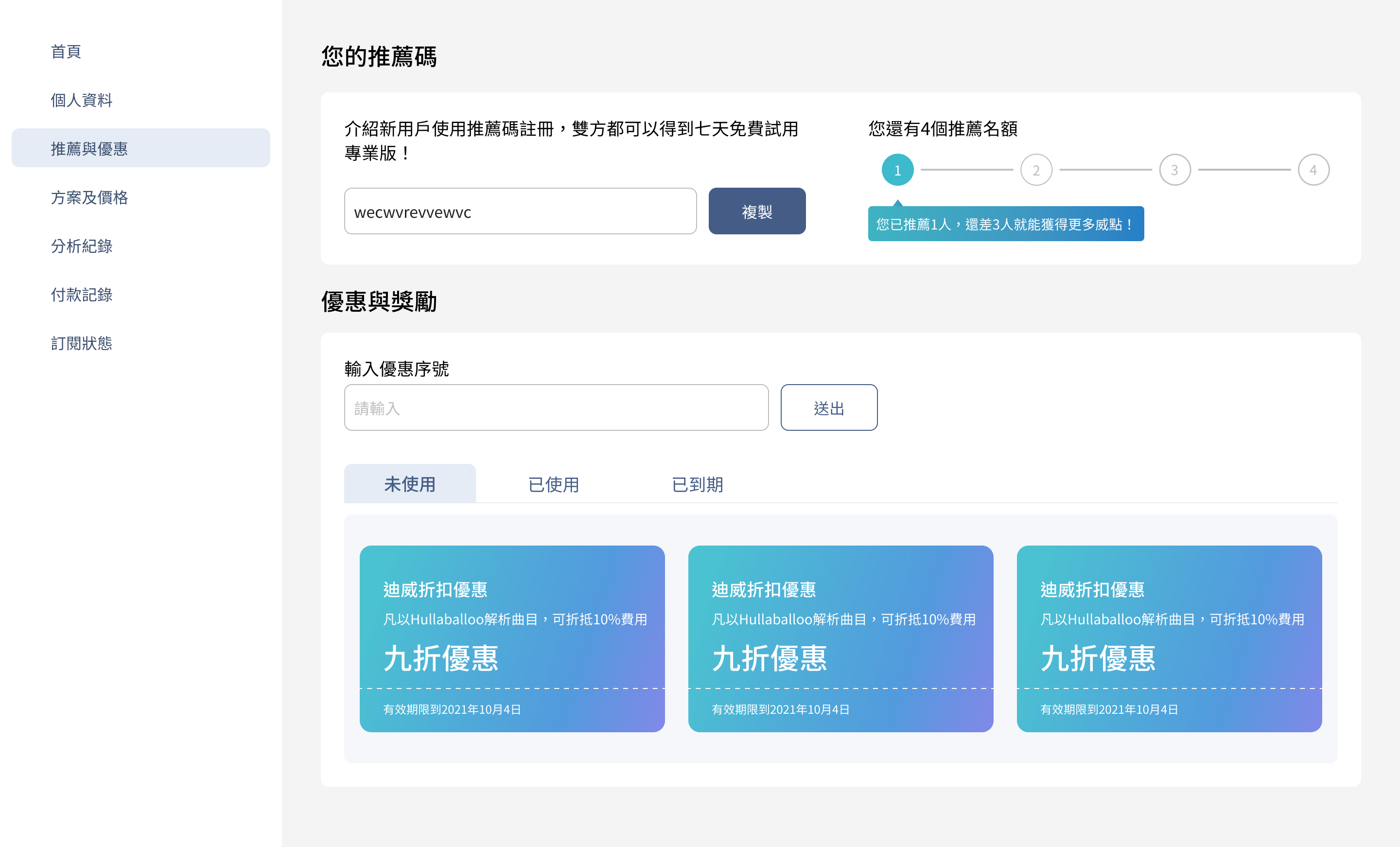
The current interface only provides a referral link for users to copy, without any visual emphasis, clear incentive, or task-based prompt. There is no indication of potential rewards, performance tracking, or motivational messaging, which makes users less likely to engage in active sharing.

Additionally, the homepage lacks interactive elements or actionable tasks that guide users to explore further. The overall experience feels passive, missing opportunities to trigger user participation or foster long-term engagement.
Problem Statement
The current Member Center fails to drive engagement and retention due to disorganized information hierarchy, lack of visible rewards, no personalization based on user behavior or membership level, and missing task-based prompts. As a result, users struggle to navigate, lack motivation to return, and are less likely to complete desired actions like referrals, purchases, or renewals.
Before
After

Before
After
Before
After

Progressive Disclosure – Delayed Optional Questions to Reduce Friction


.png)
.gif)
This moment of reflection helps users make more informed decisions, reduces avoidable churn, and generates qualitative data without feeling aggressive or manipulative.
I benchmarked platforms like Spotify, Netflix, and Duolingo, all of which use multi-step cancellation flows with soft, respectful nudges.
Our final implementation included:
4.2. Adding a Progress Bar to Marketing Pages to Boost Completion
.gif)
This app uses the Design system of Noise Eraser including button, input, header, footer, and radio button.


This project taught me how to balance business goals, UX principles, and technical constraints to drive user engagement and retention in a subscription-based model. I learned to:
Ultimately, I learned how to translate UX strategy into real business impact—building systems that not only improve usability, but also support user loyalty, reduce support costs, and enable long-term product growth.
AI Tech
AIAudio
NoiseCancellation
Web App Design
SoundDesign
Voice Enhancement
B2CDesign
RecruitmentApp
UXDesign
JobPlatform
Talent Matching
MobileUX
B2B Design
HR Tech
FormOptimization